GreenPlates+
A mobile UX/UI concept for discovering and reserving discounted surplus food from nearby restaurants and markets.
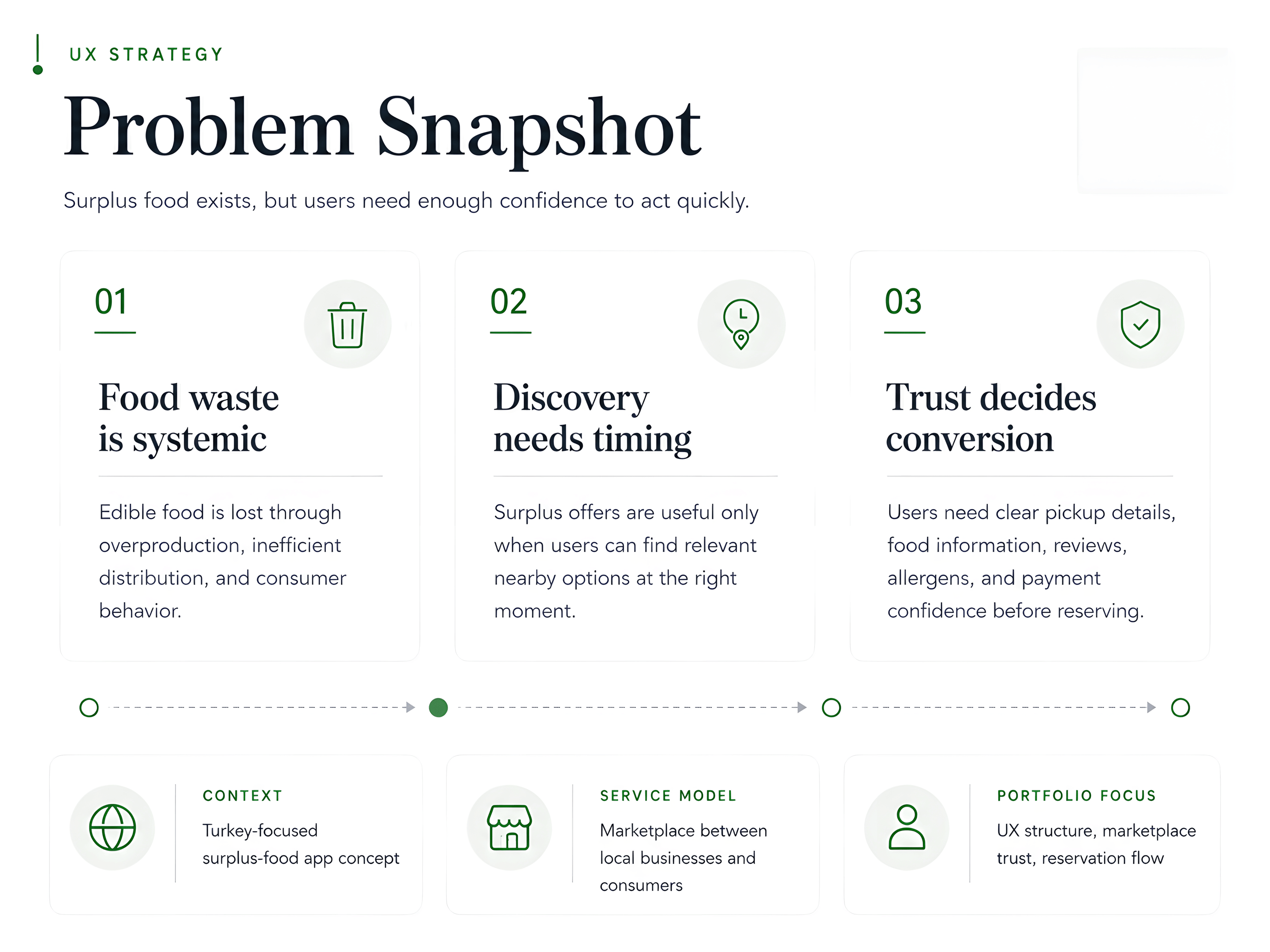
GreenPlates+ is a mobile surplus-food concept for finding discounted meals and grocery boxes from nearby restaurants and markets. The project began as a broad sustainability app idea, but its real UX value is more specific: helping people evaluate and reserve surplus food before the pickup window closes. The interface needed to handle a fast, trust-based decision under real constraints: location, timing, food quality, dietary fit and price.
The problem
Surplus-food platforms sit between sustainability and convenience. Users may want to reduce waste and save money, but the decision still happens under everyday constraints. Pickup time, food quality, distance, price clarity, allergens and seller trust all have to be answered before a reservation makes sense. The UX challenge is not listing discounted food. It is making each offer understandable and actionable before it is wasted.
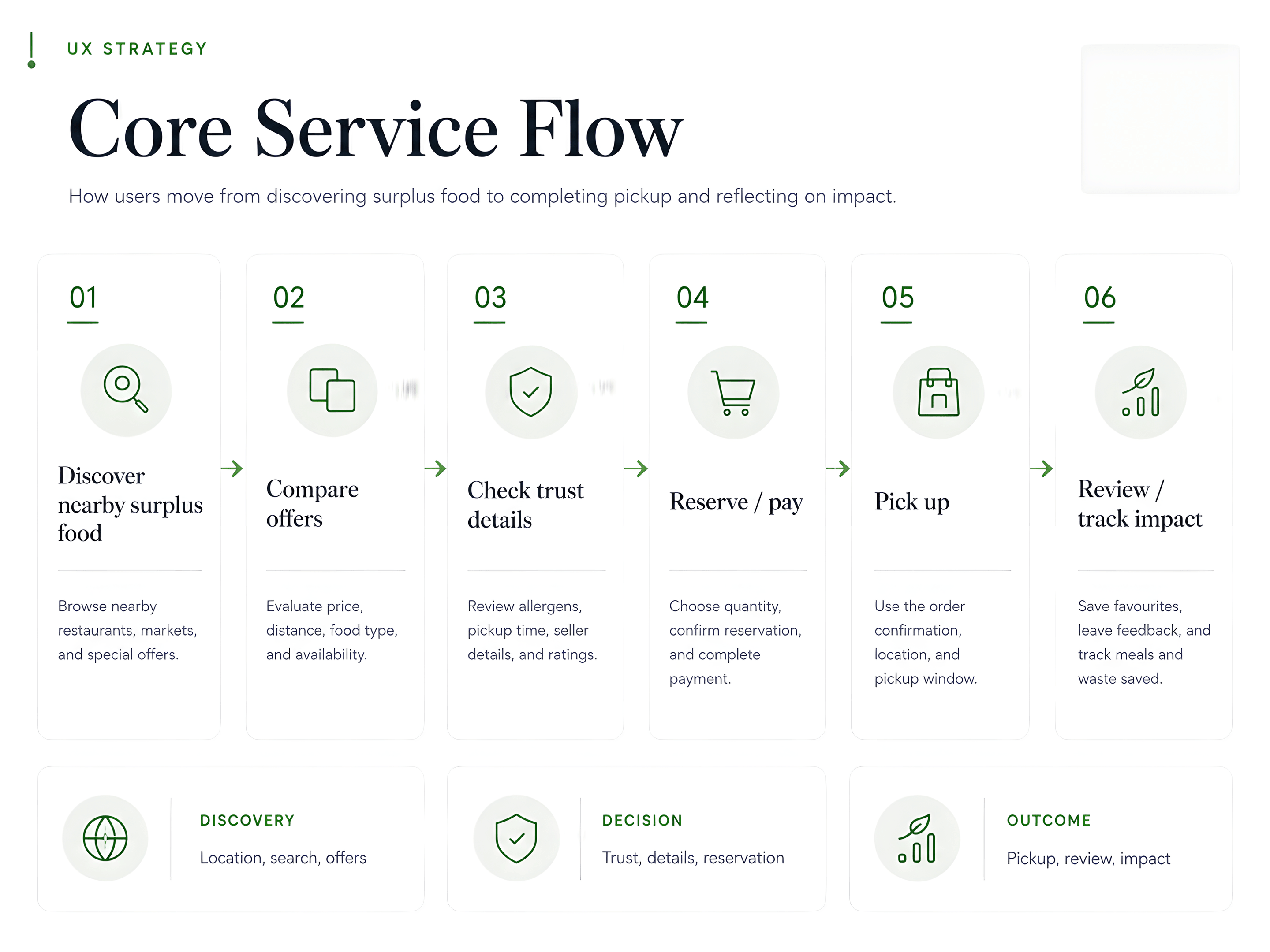
Core service flow
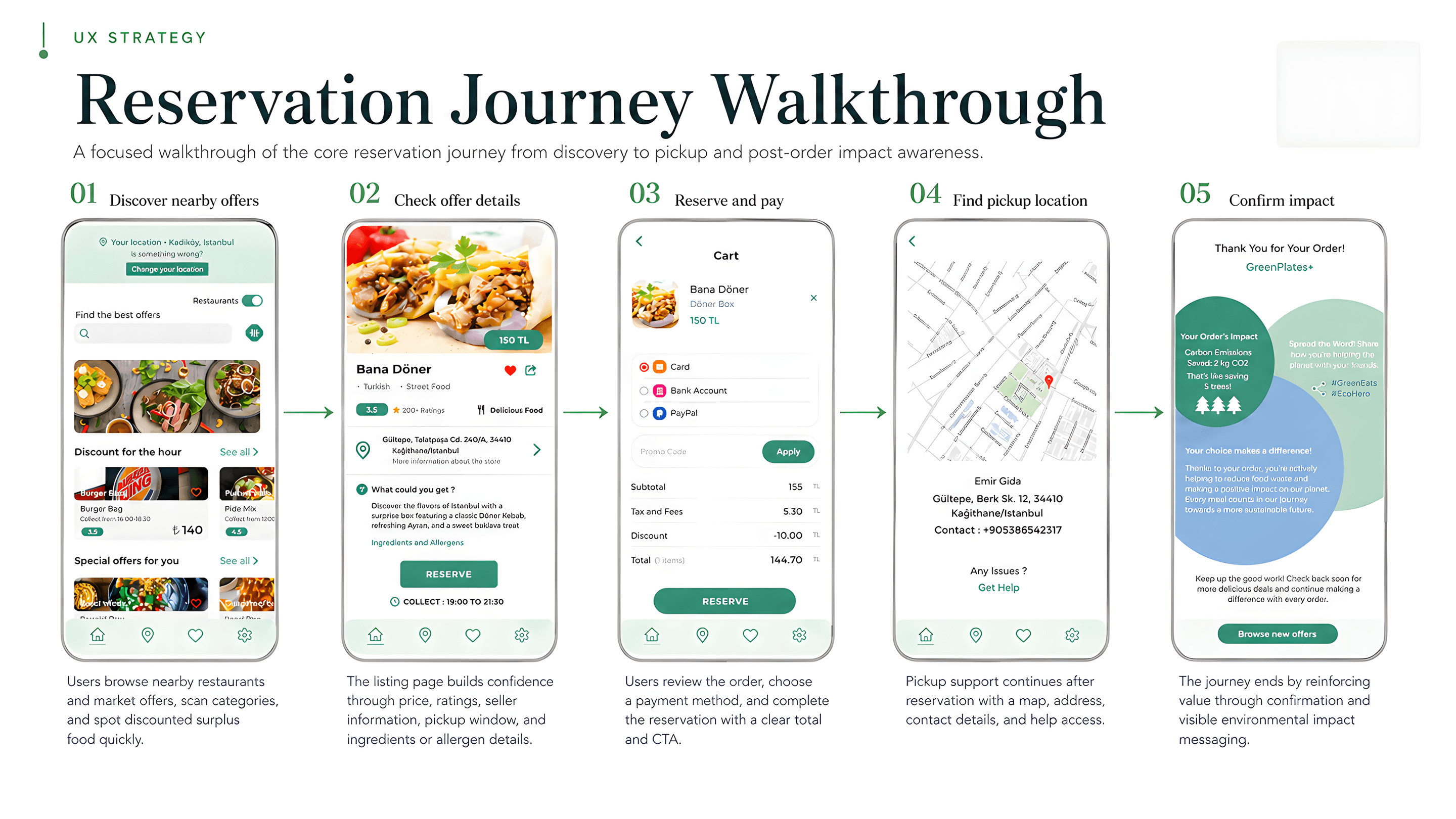
The concept was structured around six stages: discover nearby surplus offers, compare them, check trust details, reserve and pay, pick up, then review and track impact. This sequence kept the product focused on the user's actual decision path rather than treating it as a generic food delivery interface.
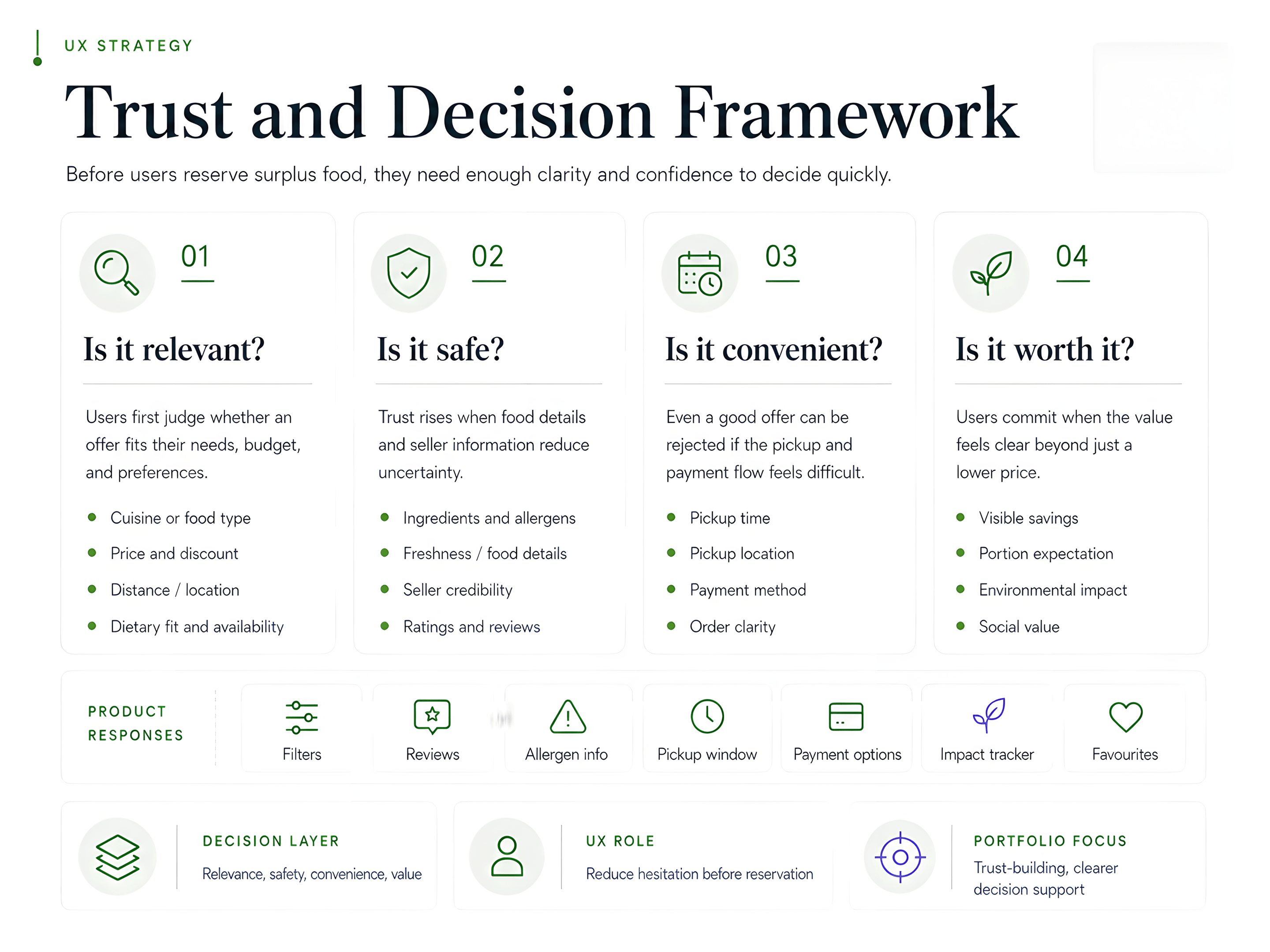
Trust and decision
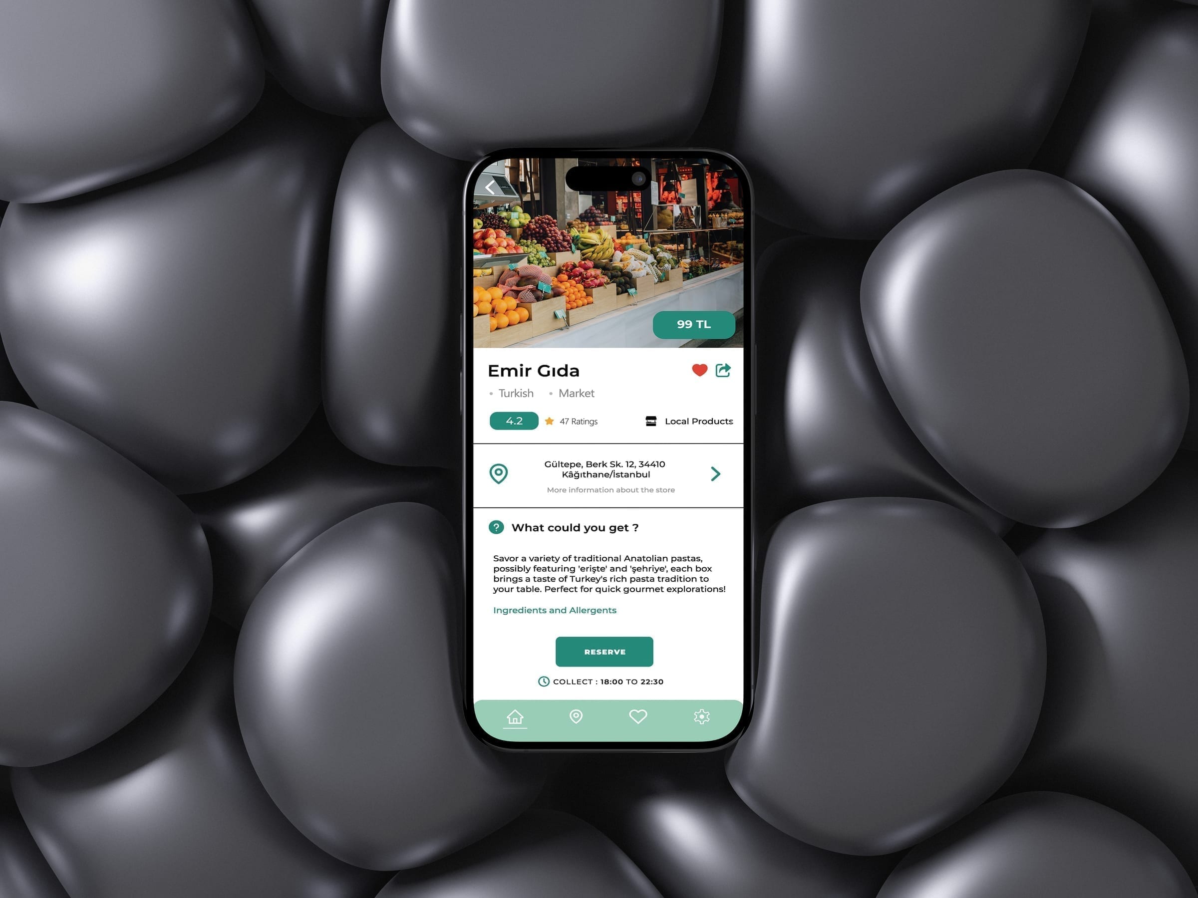
Before any reservation, users need to answer four questions: Is it relevant to me? Is it safe? Is it convenient? Is it worth it? Competitor reviews of similar apps pointed toward persistent failures on all four: disappointing food quality, missing orders, unclear fees and service-area confusion. The concept's design responses address each layer directly through filters, visible allergen info, pickup windows on cards, transparent pricing and seller ratings.
Information architecture
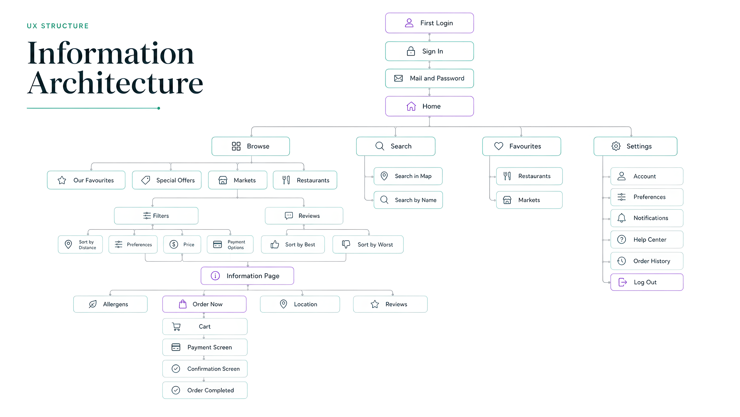
The original IA separated Browse, Search, Favourites and Settings, but several categories overlapped and the checkout path was buried under an Information Page. The improved structure reorganizes the app around the user's actual task sequence: set location, browse nearby offers, inspect details, reserve, pay, collect and review. Restaurants and Markets became segmented controls rather than competing navigation branches.
Wireframe process
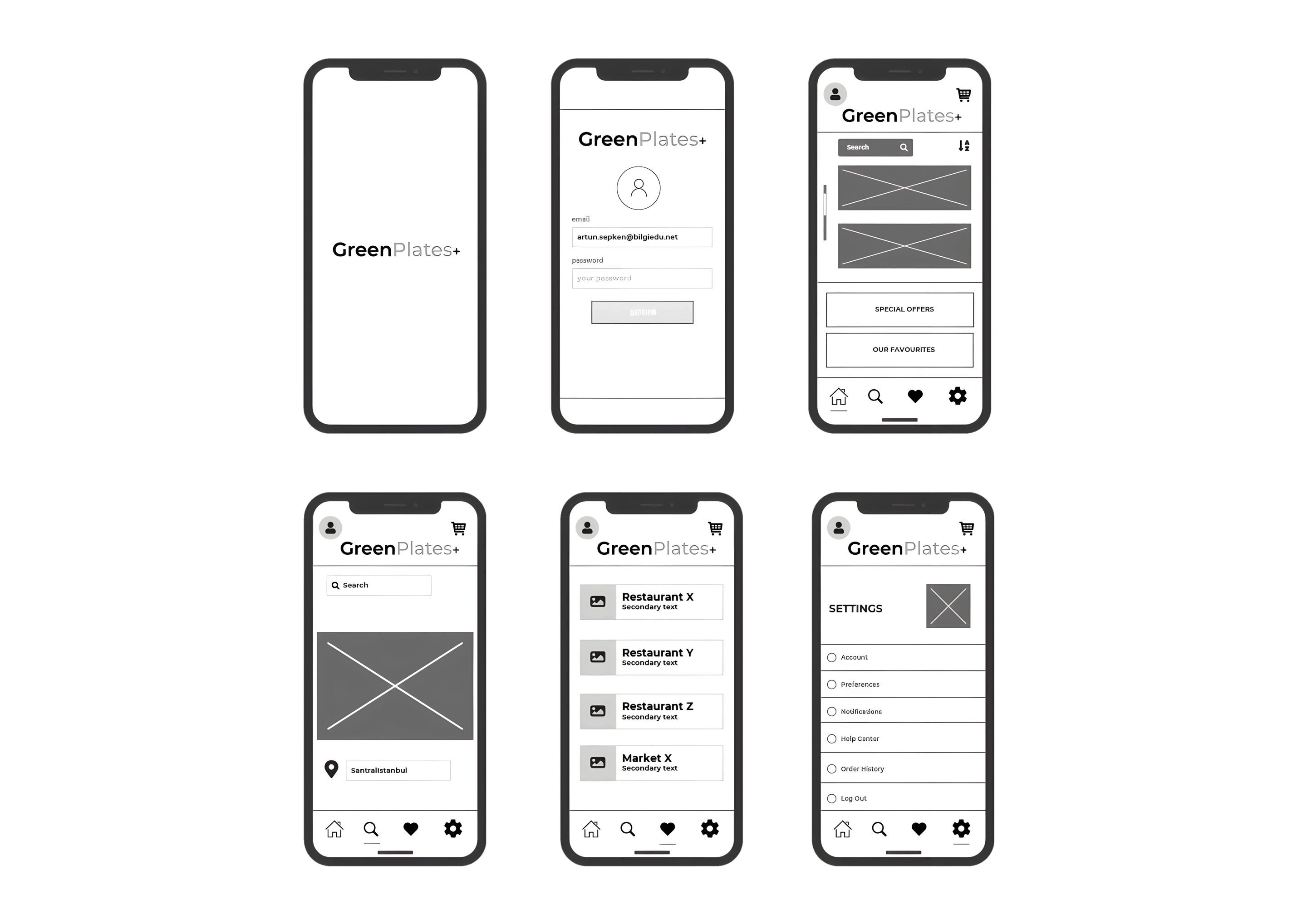
The wireframes established the core layout logic before any visual decisions: splash, login, home with search and categories, location-based discovery, restaurant/market list and settings. These frames kept structural decisions separate from surface decisions and grounded the IA in actual screen behaviour.
From findings to improvements
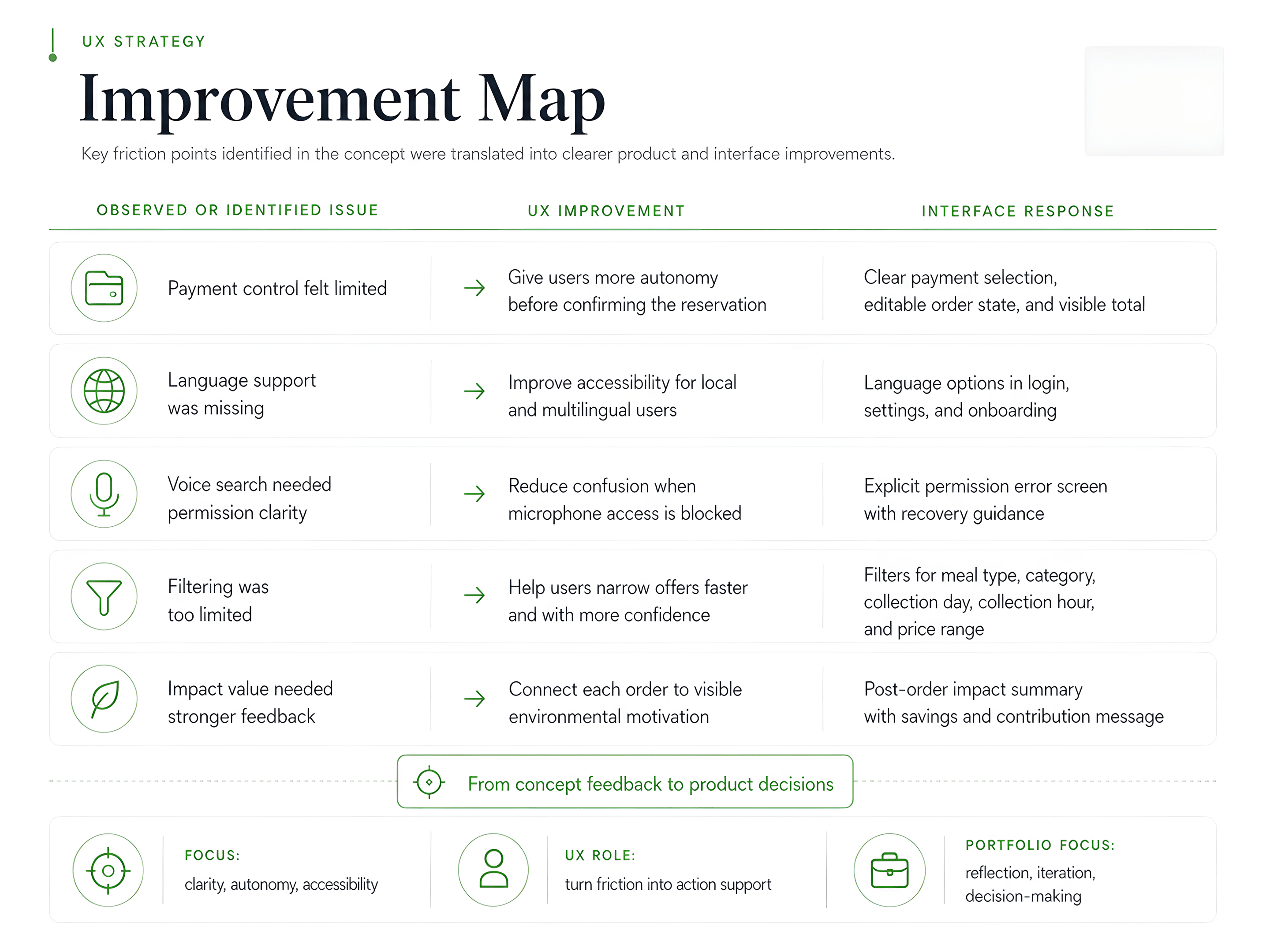
A task-based usability walkthrough with one participant checked the main flows across login, browsing, filtering, offer detail, reservation, payment and settings. It surfaced five concrete friction points that shaped the interface iteration: payment control, language support, voice search permission, filtering depth and impact visibility.
Reflection
GreenPlates+ is a student UX/UI concept with a broad prototype and an early usability walkthrough. Its value is in showing how food-waste research, local Istanbul context, information architecture and interaction structure can be translated into a focused discovery-reservation-pickup flow. If continued, the next step would be testing with more users, simplifying the filter logic, validating pickup and payment expectations and designing the business-side listing workflow.
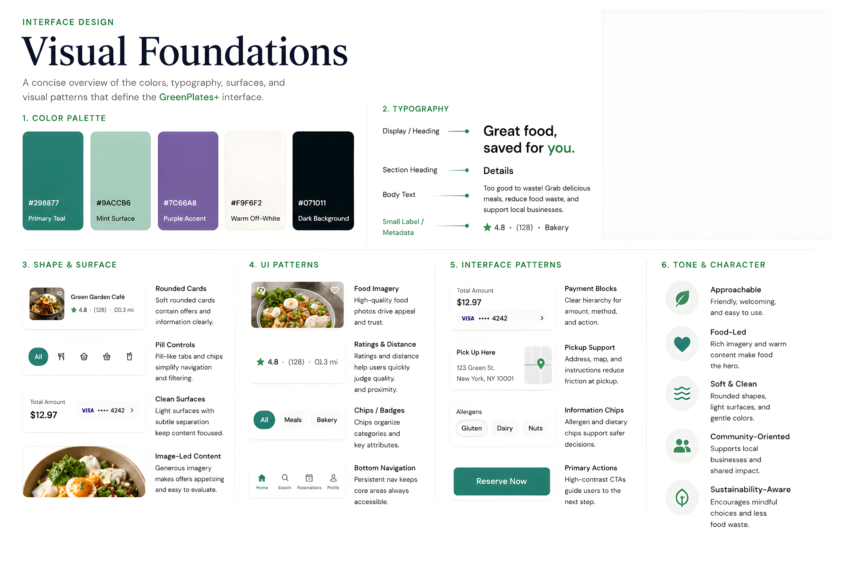
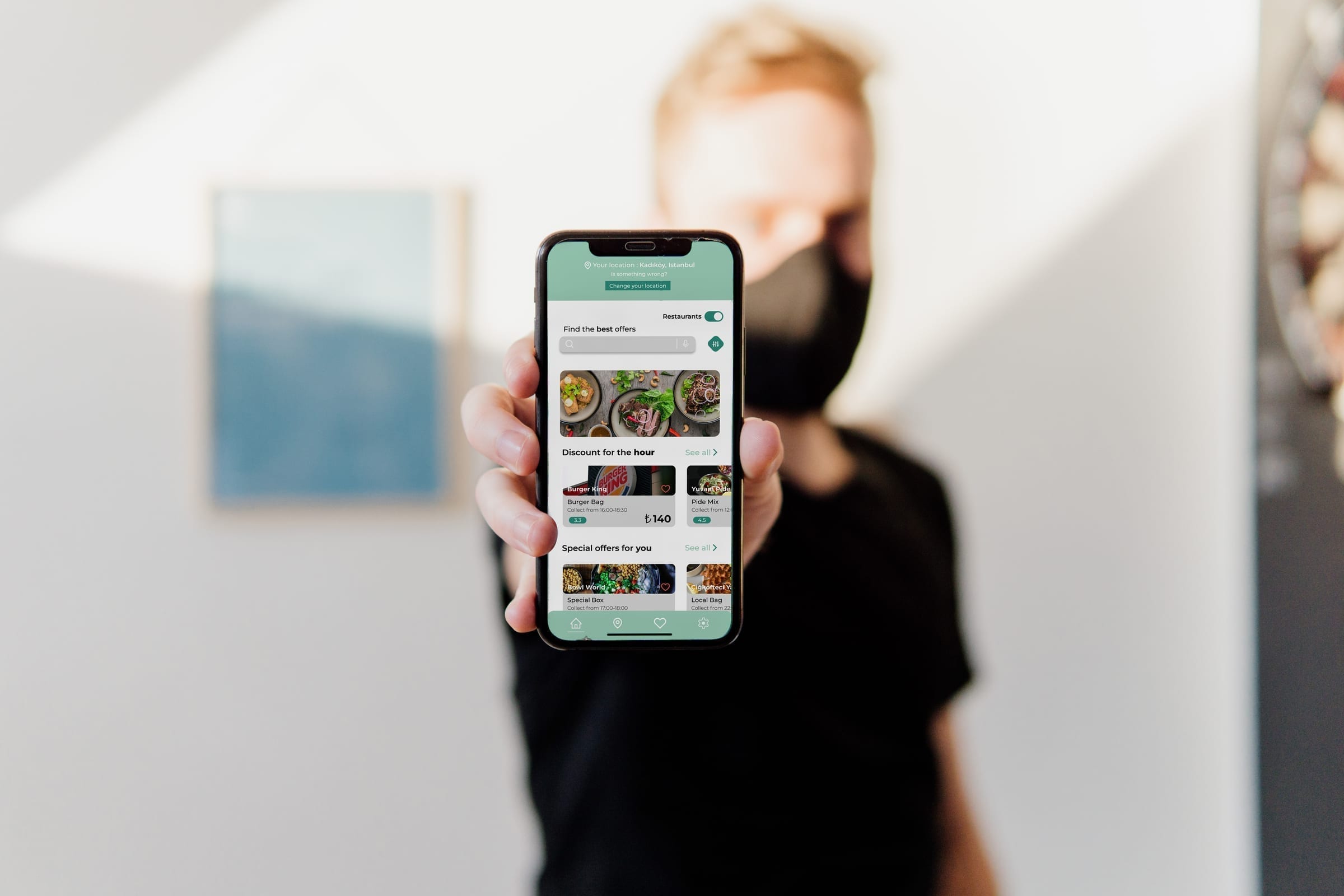
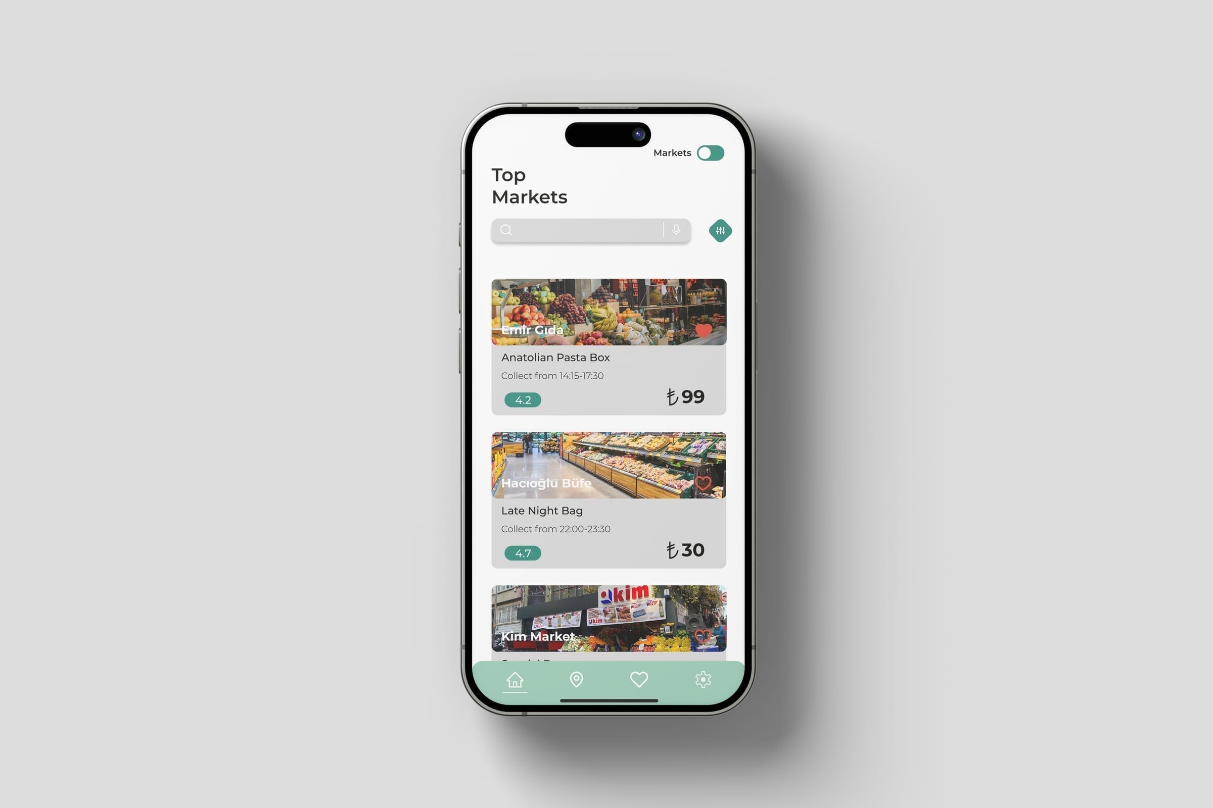
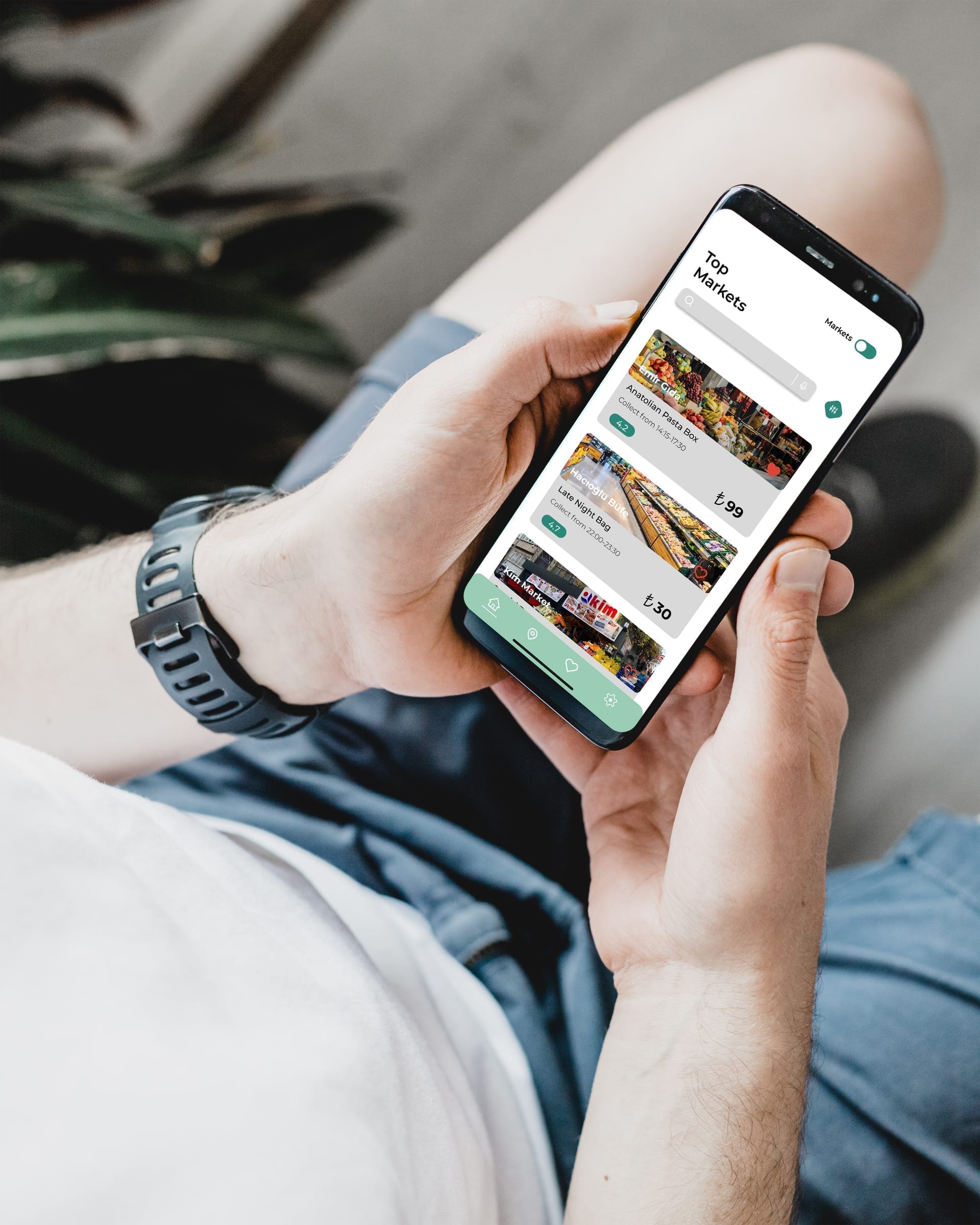
The interface uses a soft green-led visual language, image-forward offer cards, rounded surfaces and persistent bottom navigation. The goal was to make surplus food discovery feel local and approachable while keeping pickup time, price, seller type and reservation action easy to scan at a glance.
Reservation journey
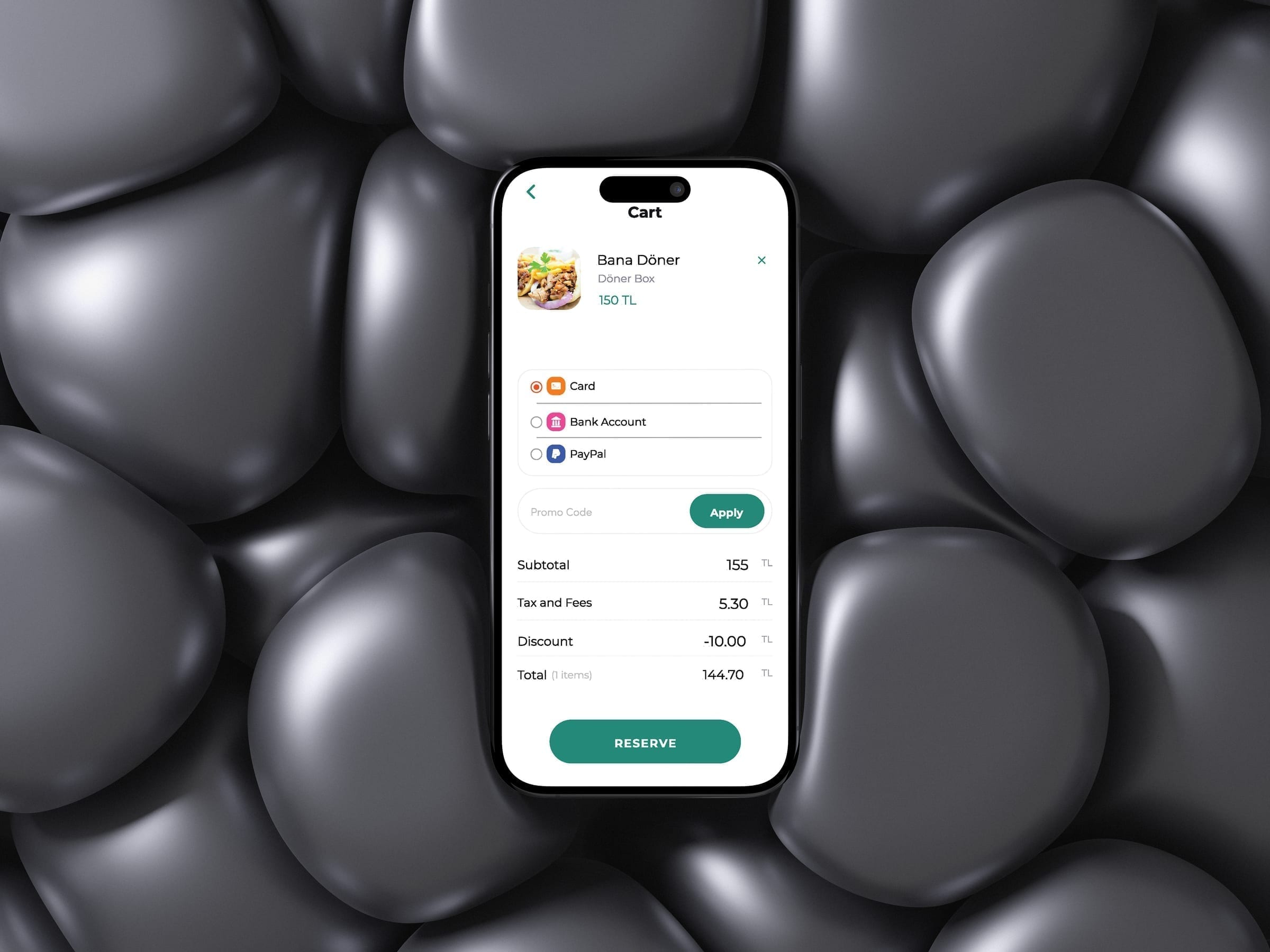
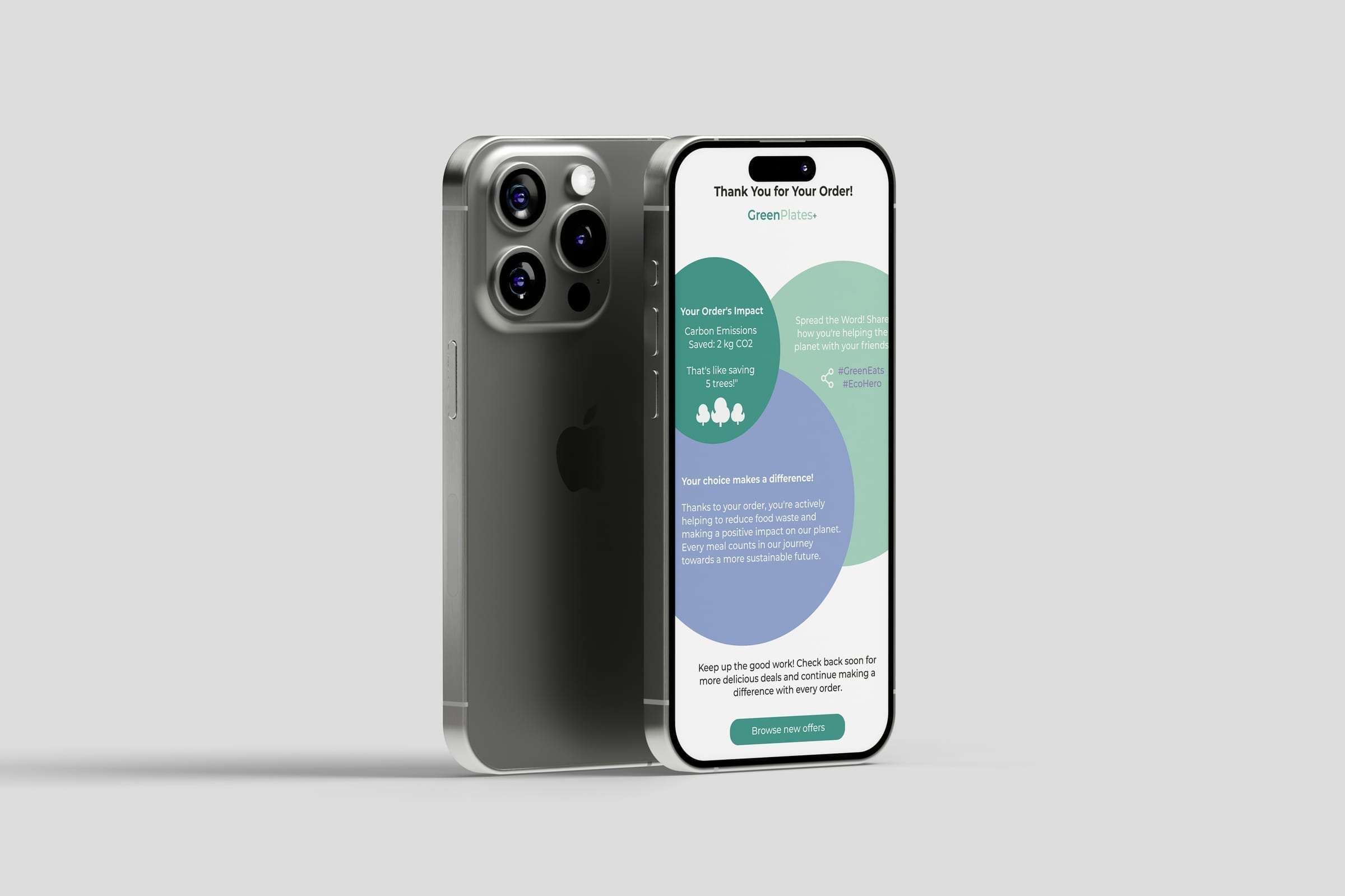
The five core screens follow the user from discovering nearby offers through checking details, reserving, finding the pickup location and receiving an impact confirmation. Each step is designed to reduce the decision effort at that specific moment rather than front-loading all information at once.
Screen system
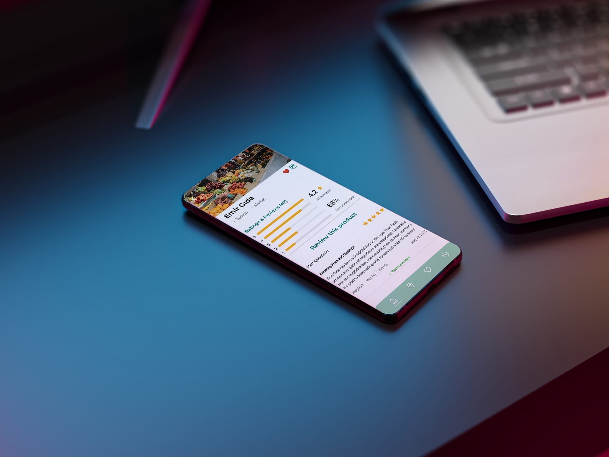
Selected screens show the app across its main states: home discovery, market listings, offer detail, cart and payment, impact confirmation and reviews. The restaurant/market segmented control, filter modal and bottom navigation appear consistently across all states.
Visual foundations
The palette is built around deep forest green, mint and a muted purple accent on warm off-white surfaces. Rounded cards, image-led offer thumbnails and a persistent bottom navigation create a visual language that feels local and approachable without relying on generic eco-design clichés.