E-Bilet
A mobile UX/UI concept for Turkey's intercity rail ticketing experience, focused on route search, timetable comparison and trip management.
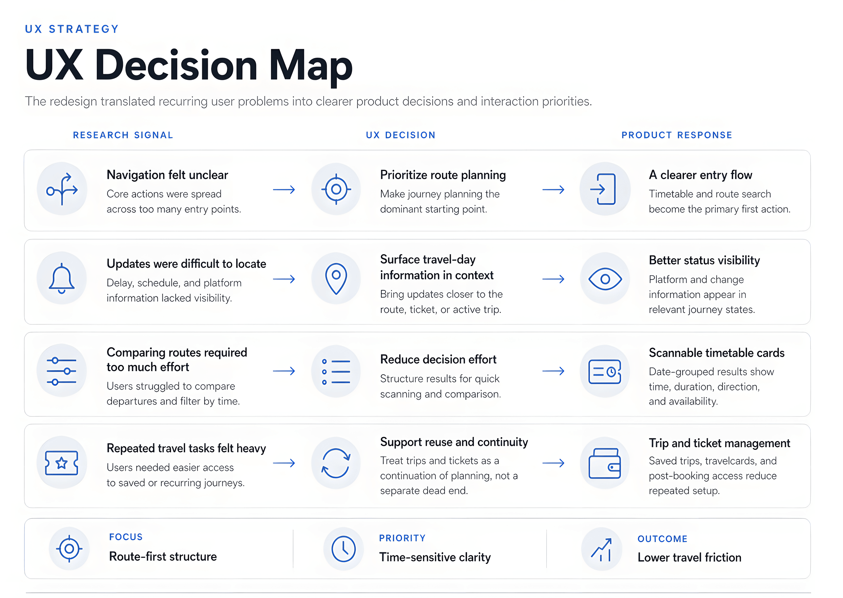
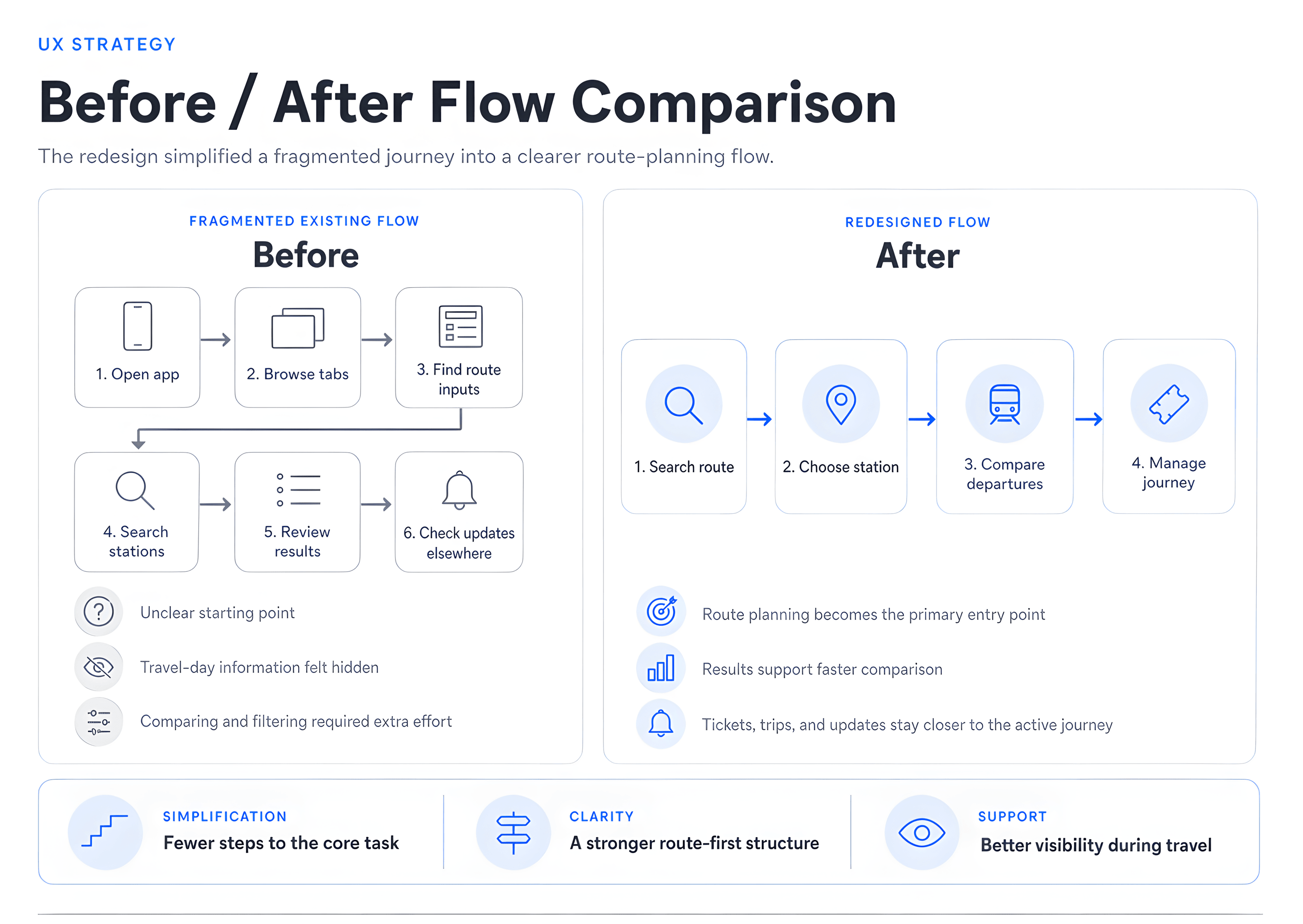
E-Bilet users need to plan and manage intercity rail journeys under time pressure. The original experience made this harder by spreading key actions across unclear navigation, making timetable updates difficult to surface and hiding important travel details such as platform information. The redesign focuses on a clearer route-first flow supported by searchable stations, recent trips, timetable cards and trip-management states.
Where the experience broke down
A route-first task model
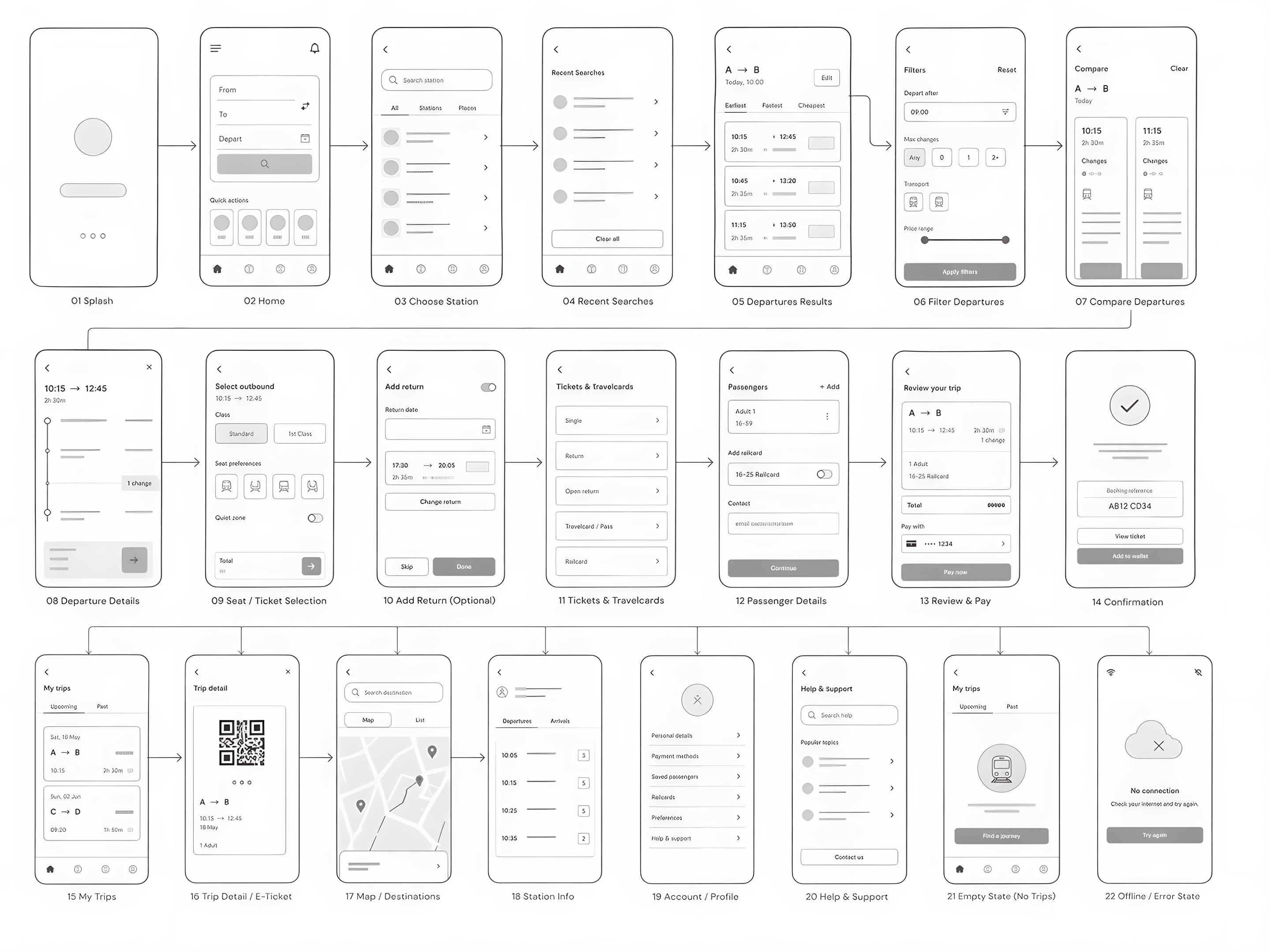
Instead of treating every screen equally, the redesign focuses on the moments where clarity matters most: starting a route search, comparing available journeys and keeping trip information within reach after booking. The app is organised around a route-first journey: users begin with a travel need, narrow it through station search, compare available departures and keep the journey accessible after booking.
Key flow: planning a journey
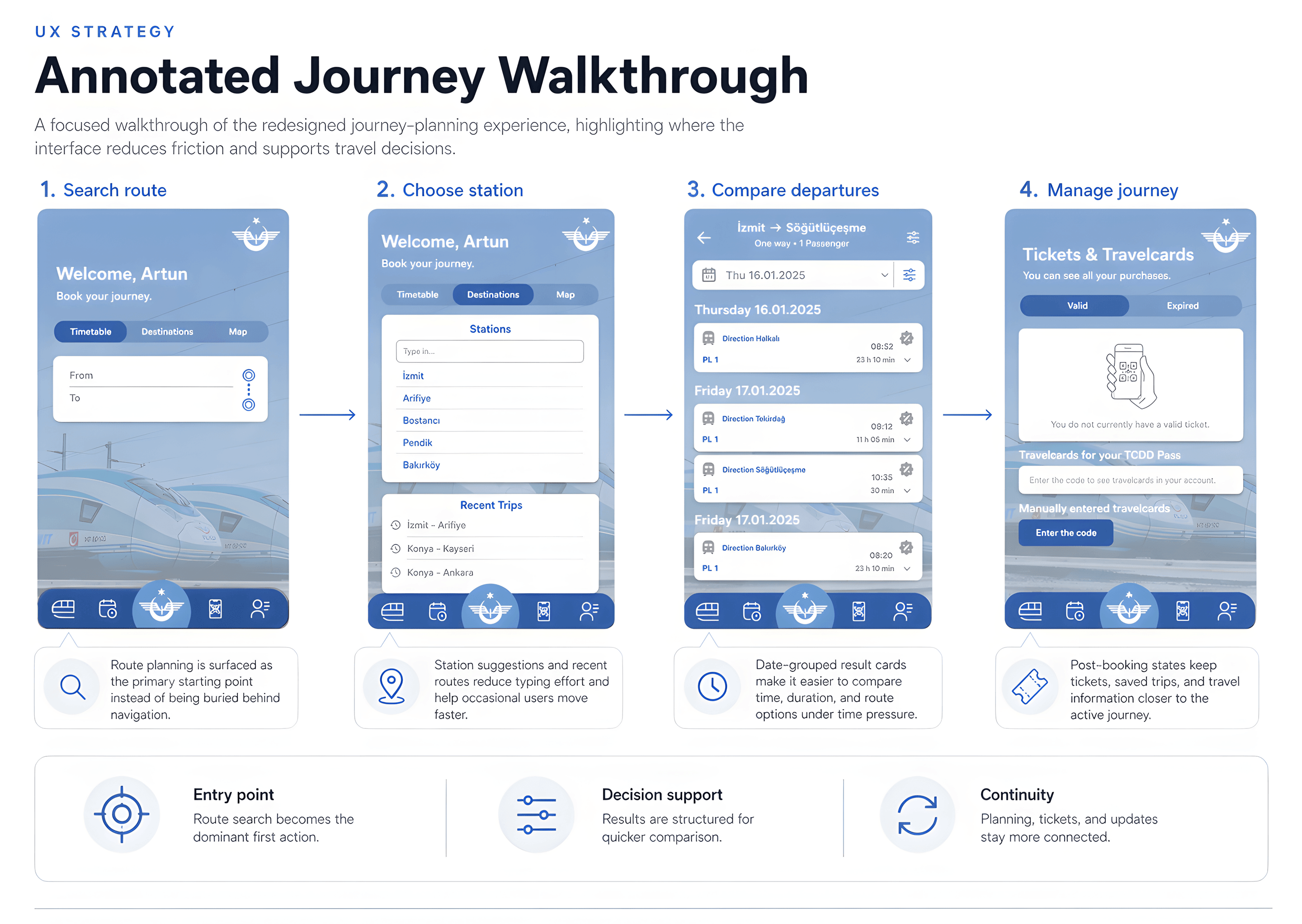
Early research and evaluative testing pointed to three recurring issues: navigation friction, weak visibility of travel updates and difficulty accessing platform information. The following screens show how the redesign addresses each moment in the rail journey.
- 1.Open app
- 2.Browse tabs
- 3.Find route
- 4.Search stations
- 5.Review results
- 6.Check updates elsewhere
- 1.Search route
- 2.Choose station
- 3.Compare departures
- 4.Manage journey
Supporting UX improvements
Reflection
This project began as a student redesign exercise, but the strongest part of it remains the service-flow question: how can a rail ticketing app make time-sensitive travel tasks easier to complete? If I developed it further today, I would validate the route-planning flow with real users, simplify the information architecture further and refine how delays, platform information and trip changes appear across the journey. The strongest lesson from this project was that transport UX does not need more screens. It needs clearer prioritisation of the right moments.
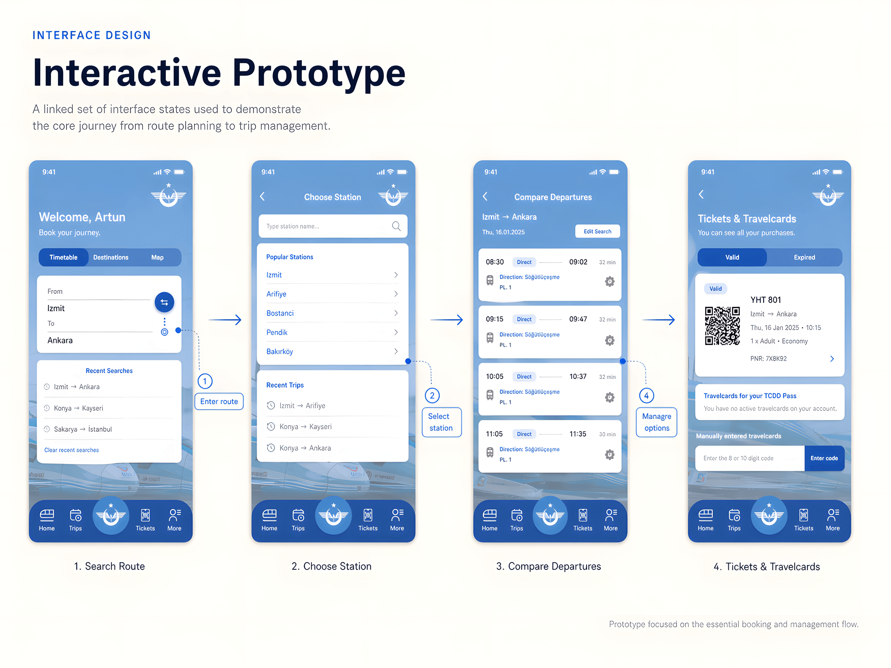
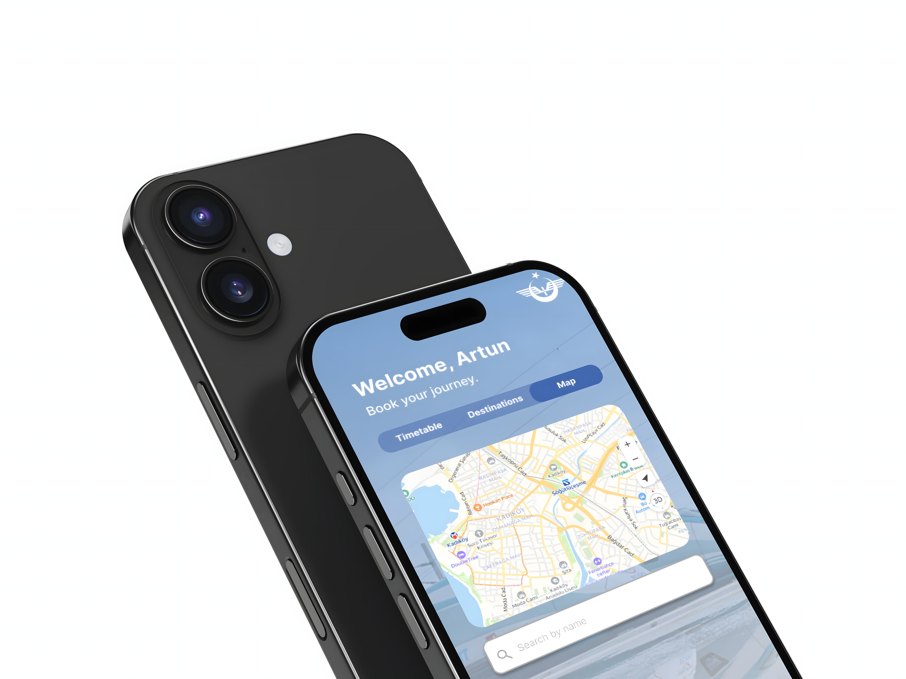
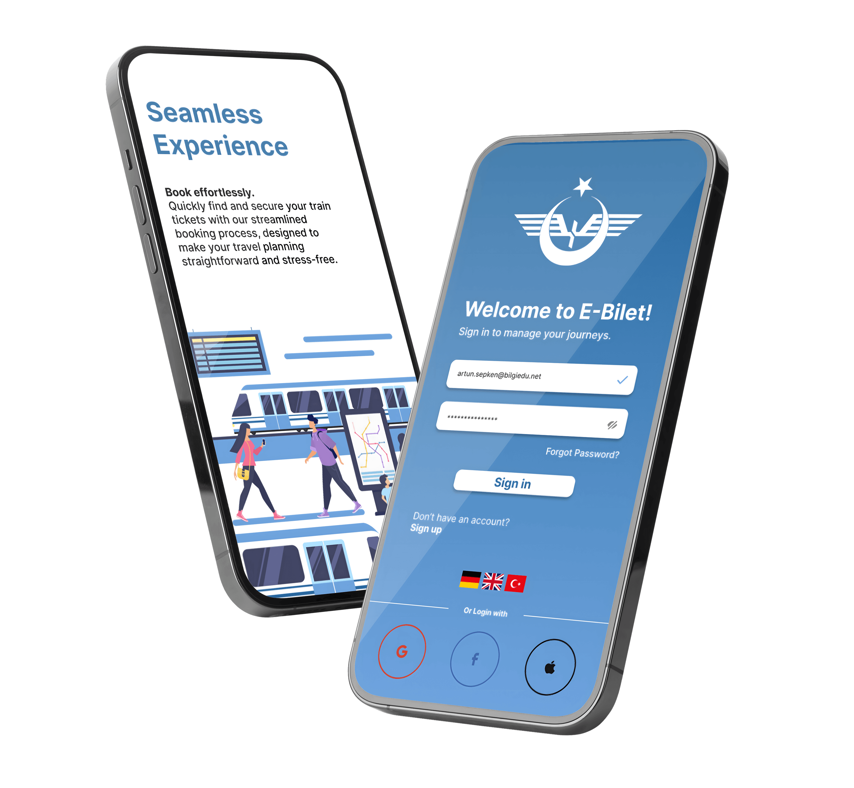
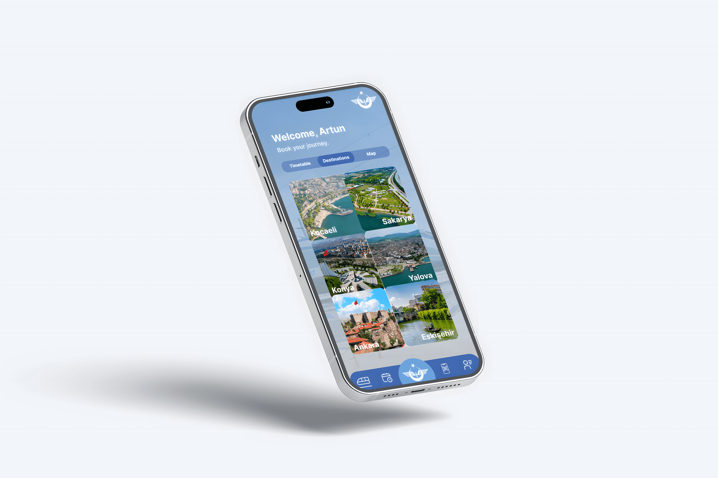
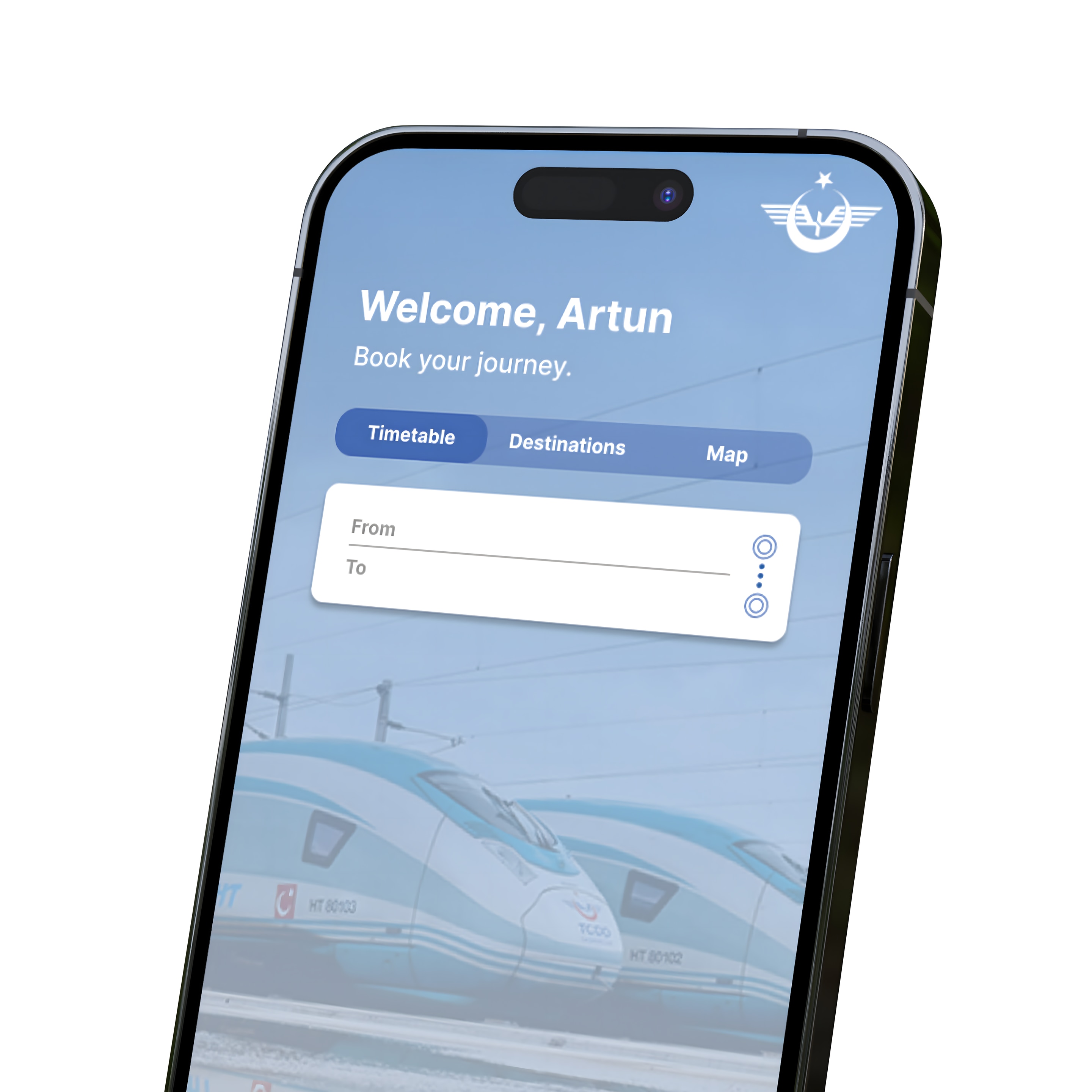
The interface redesign keeps the railway context visible while reducing visual and navigational noise around the main travel tasks. Route search, timetable comparison, saved trips and ticket access are treated as connected parts of the same journey rather than separate destinations inside the app.
Interface overview
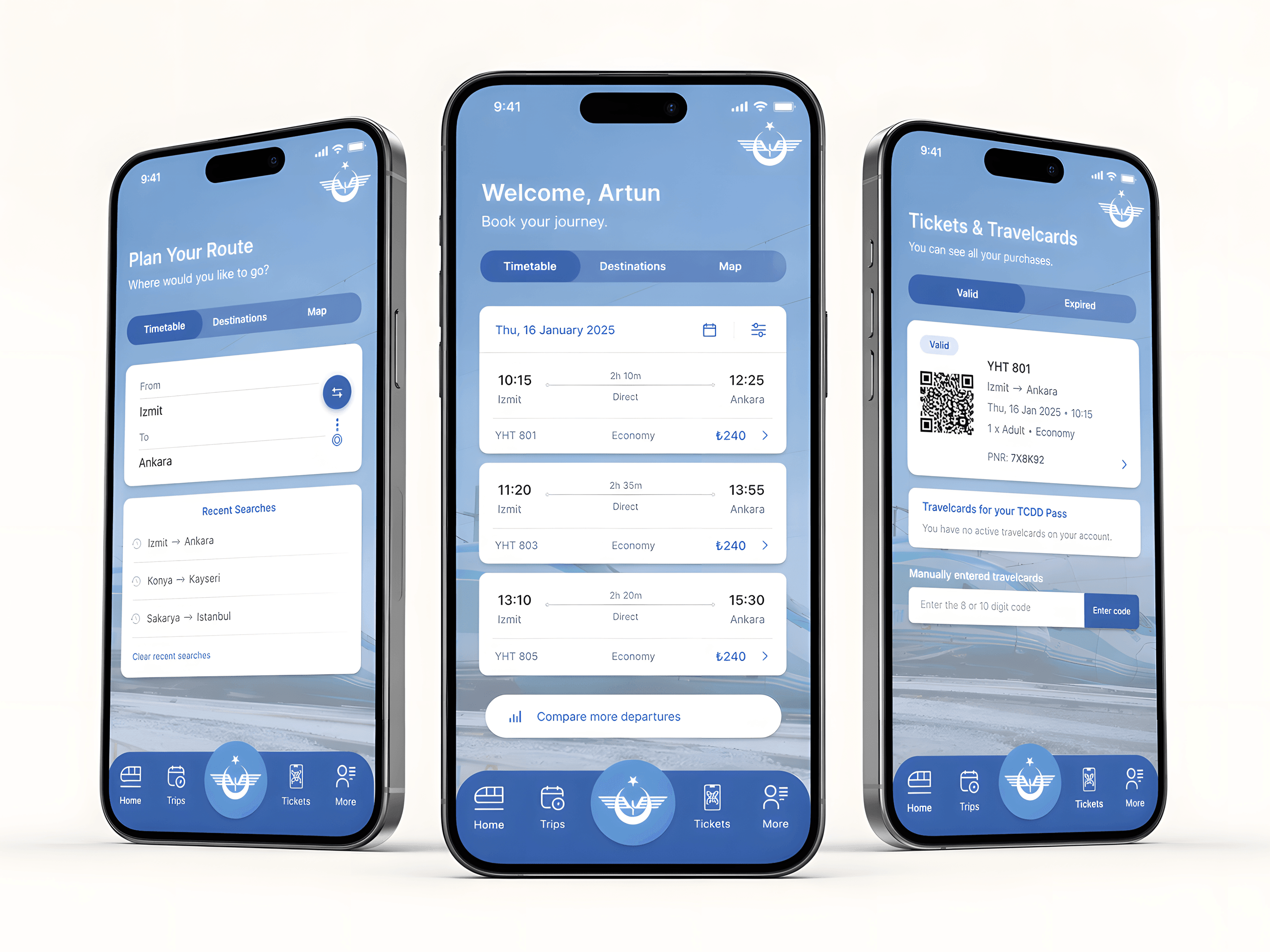
Screen system
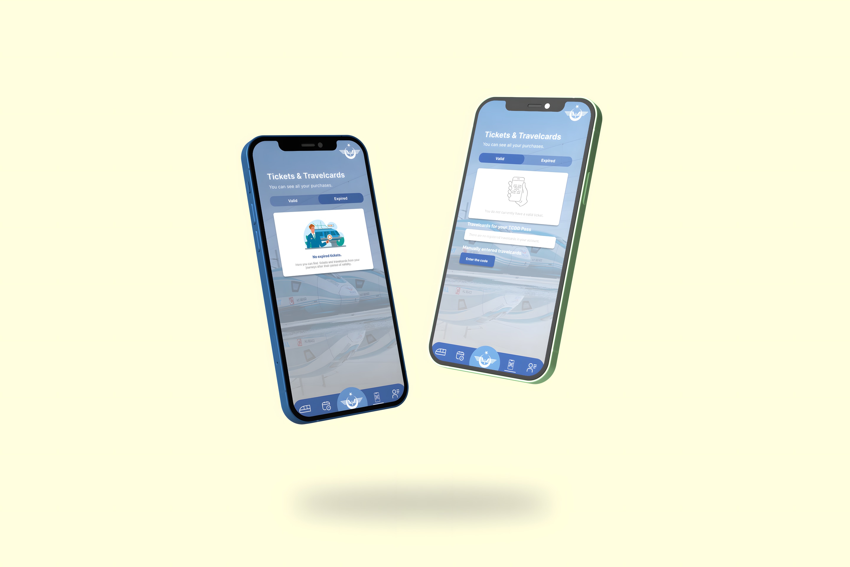
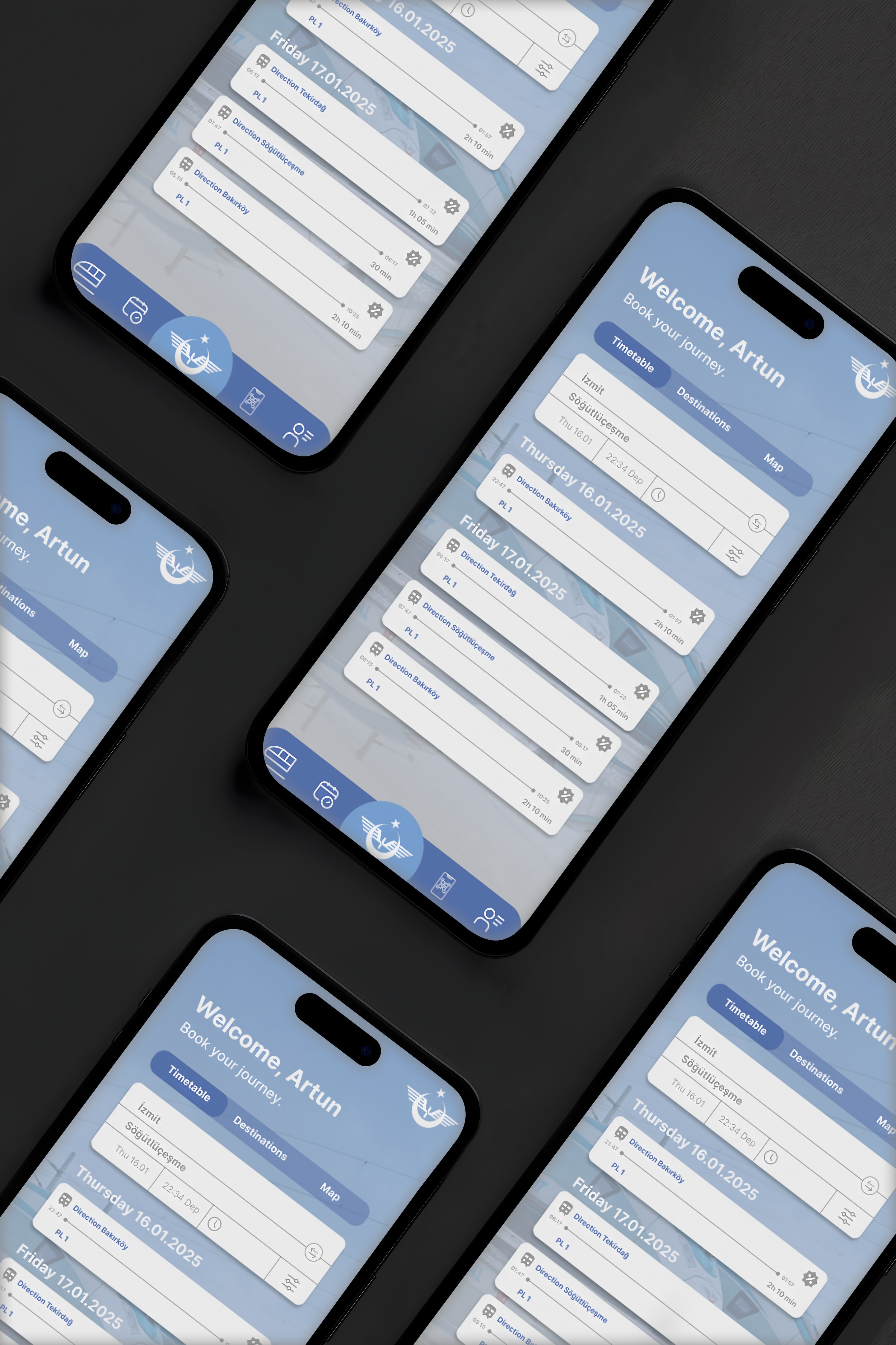
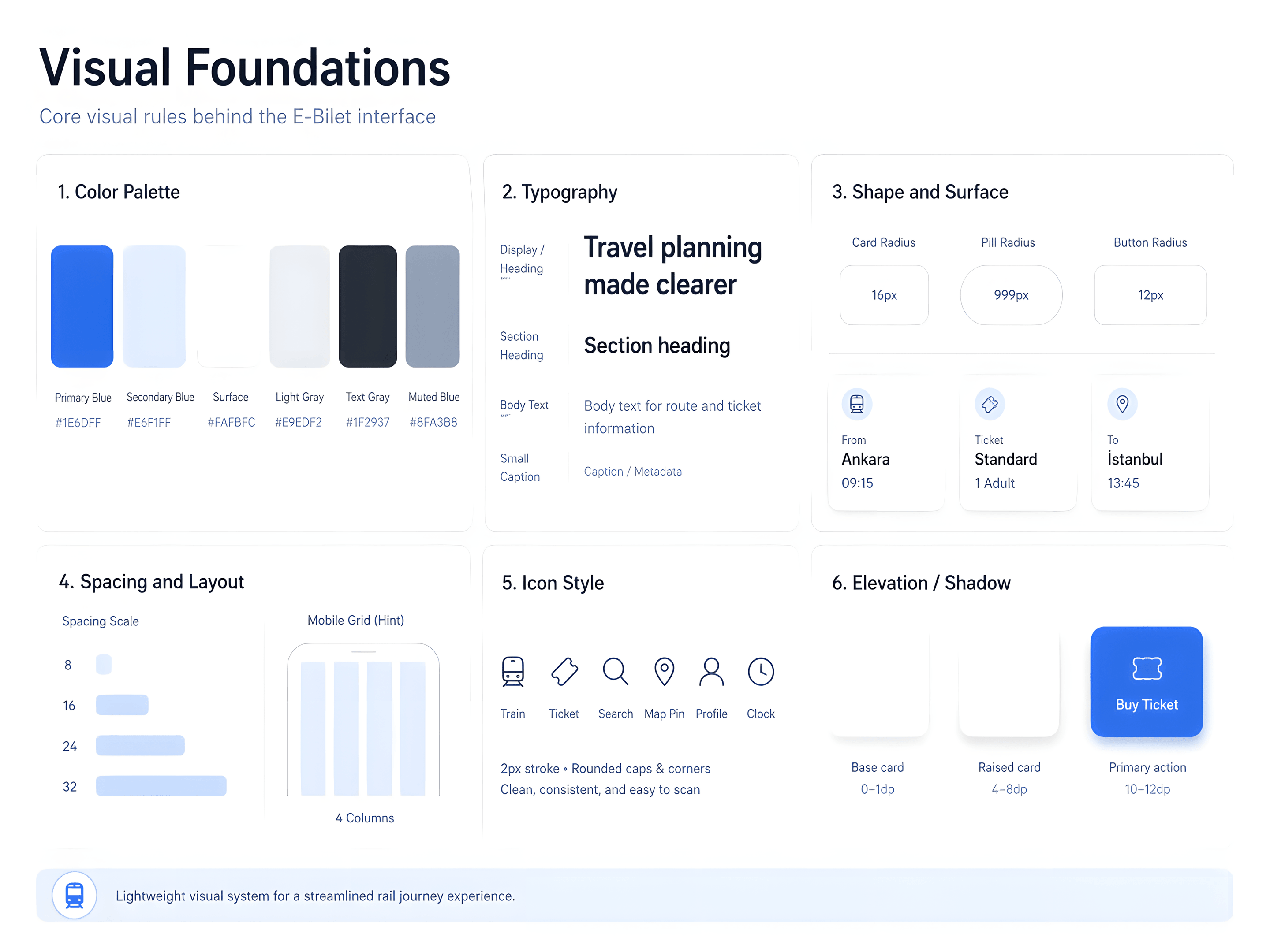
The visual system uses a blue-led palette, rounded card surfaces, persistent navigation and lightweight iconography to make the app feel approachable while keeping core travel information easy to scan. Instead of treating each screen as a separate composition, the redesign relies on repeated interface components.
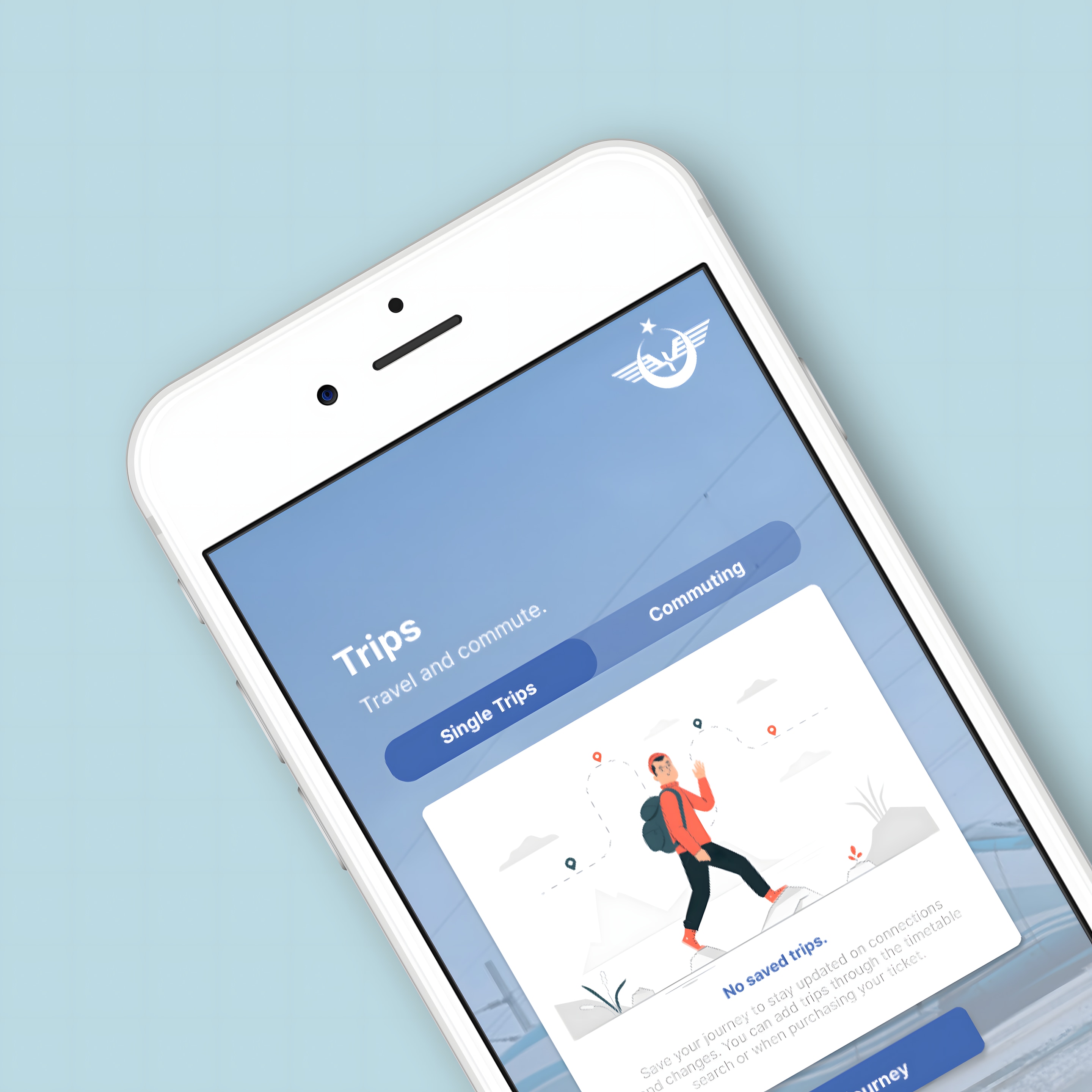
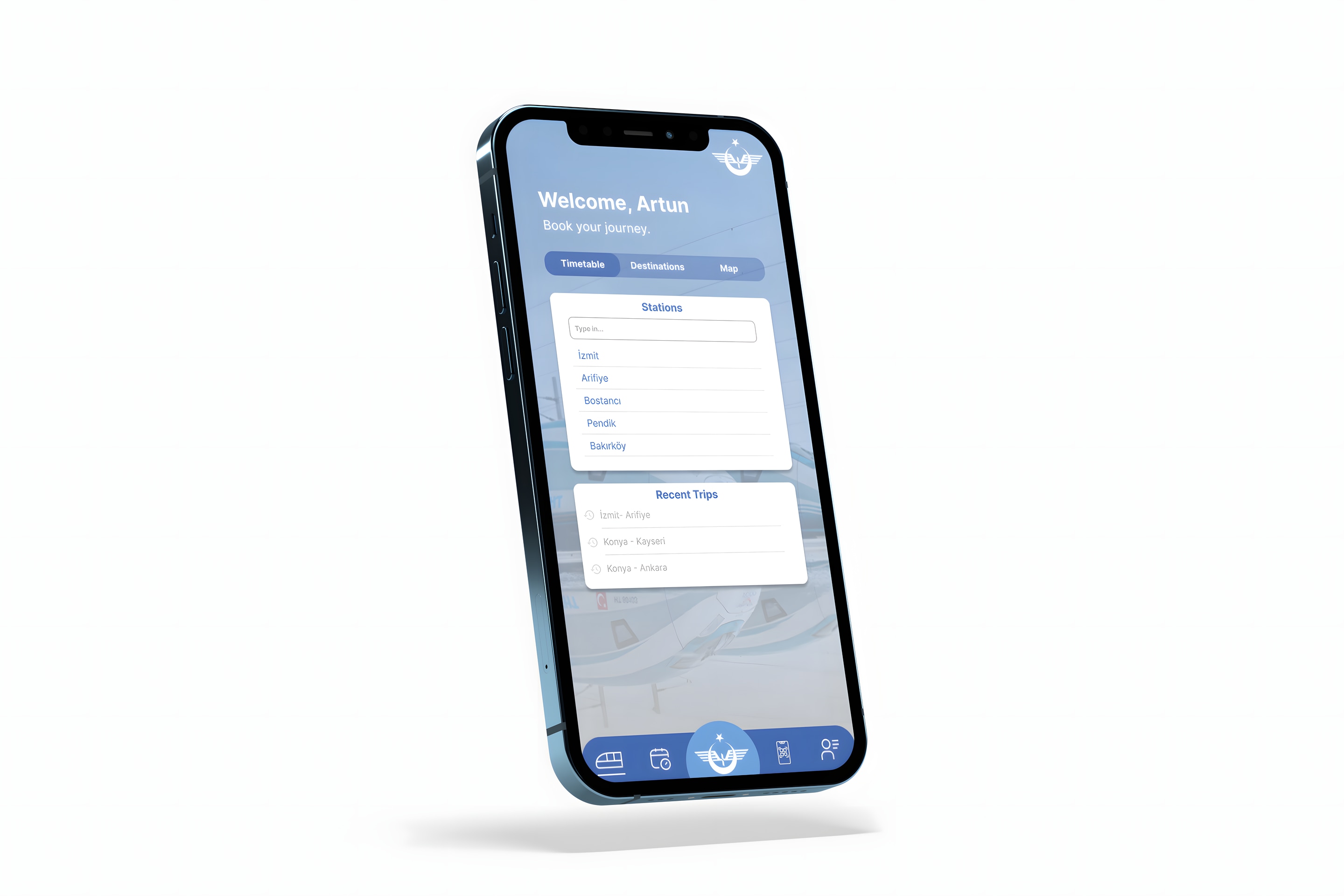
Component system
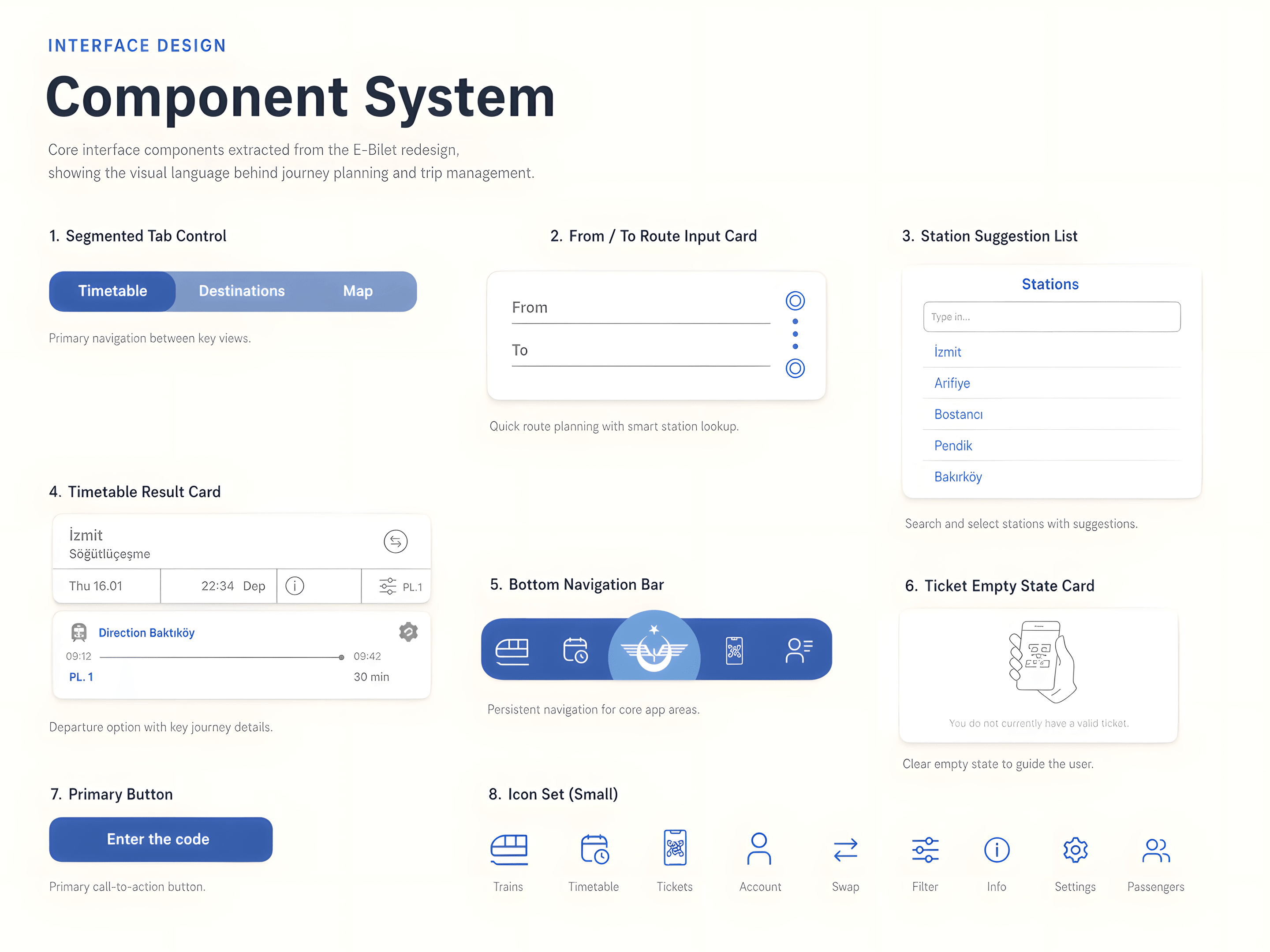
Instead of treating each screen as a separate composition, the redesign relies on repeated interface components: segmented controls, From/To route inputs, station lists, timetable cards, empty states and a persistent bottom navigation. These patterns help the app feel more predictable across planning and post-booking tasks.
Visual foundations
Prototype flow