Credit Suisse: A Speculative Rebrand
A speculative rebrand for Credit Suisse, framed as an attempt to restore trust through a return to Swiss roots. Research, identity system, and applications.
In March 2023, Credit Suisse's share price fell sharply after its largest shareholder ruled out further investment. Despite a 50 billion franc liquidity backstop from the Swiss National Bank, confidence continued to erode and UBS moved quickly to acquire the bank. This project is a speculative brand exercise: what would it have taken, on the identity side, to rebuild trust? Not a new logo for the sake of novelty, but a return to the bank's origin story as a Swiss institution.
Why a rebrand
Credit Suisse Group AG was founded in 1856 in Zurich as the Schweizerische Kreditanstalt, a cornerstone of Swiss banking. The bank's identity drifted from this origin over decades of consolidation and international expansion. This rebrand treats the 2023 crisis as a forcing function to reaffirm what the bank was: Swiss, conservative, long-term, trusted. The premise: you can't rebuild trust by looking more modern. You rebuild it by looking more like what you were.

Historical research
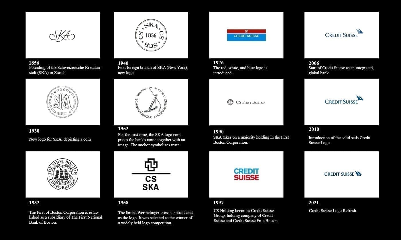
The research started with the bank's own logo history: the 1856 founding mark for Schweizerische Kreditanstalt, the 1940 New York expansion, the 1976 red-white-blue mark, the 1990 First Boston merger, the 1997 Credit Suisse Group consolidation, the 2021 refresh. The current mark was the culmination of 165 years of abstraction away from specifically-Swiss visual language.
The Wermelinger cross
The proposed mark reintroduces the Wermelinger cross, an early Credit Suisse symbol selected through a design competition and used in the bank's pre-consolidation era. Built from four interlocking right angles around a central negative square, the mark reads as Swiss by geometric construction alone: precise, conservative, reducible. It refers to the Swiss flag without copying it, and signals continuity with the bank's pre-international history.

Identity system
The colour system anchors on a deep institutional navy, with Swiss flag red as the single accent, neutral greys for secondary use, and a warm off-white for paper and digital ground. The palette deliberately avoids the light blues common in contemporary banking brands, too friendly for the positioning.


Applications
Application design focuses on the branded surfaces where trust is either built or lost: physical branch signage, corporate stationery, the annual report, and mobile banking. Each surface was designed to communicate institutional continuity first, contemporary digital fluency second.