MindMesh
A role-based micro-learning platform concept that helps non-technical creative users learn AI tools through personalized paths, modular lessons, and hands-on tool pages.
MindMesh is a senior UX/UI and learning-experience prototype for a web-based micro-learning platform. The project addresses a real adoption problem: non-technical creative users are not blocked by a lack of AI tools. They are blocked by a lack of structured, role-relevant guidance. The platform organizes AI tool learning around onboarding, personalized paths, modular lessons, tool pages, quizzes, progress feedback, and community support. It was developed across proposal, prototype, testing, and final presentation phases during 2024–2025.
The challenge
AI tools are increasingly present in creative and professional work, but the learning experience around them is fragmented. Non-technical users move between scattered tutorials, tool-specific documentation, social media tips, and trial-and-error. This creates a gap between curiosity and confident use: users may know a tool can generate images, automate content, or support ideation, but they do not know which tool fits their goal, what terminology matters, how to structure prompts, or how to apply the output inside a real workflow. MindMesh reframes this as a learning-experience design problem rather than an interface problem.
Research signals
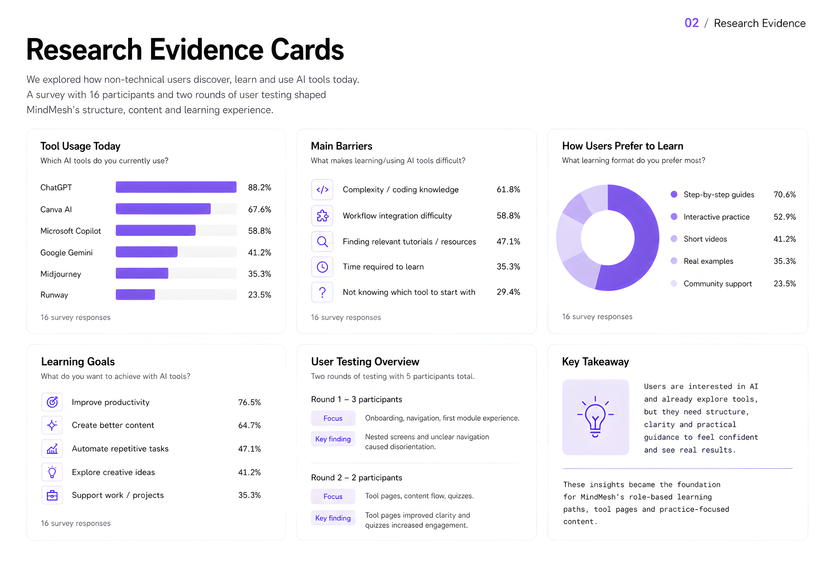
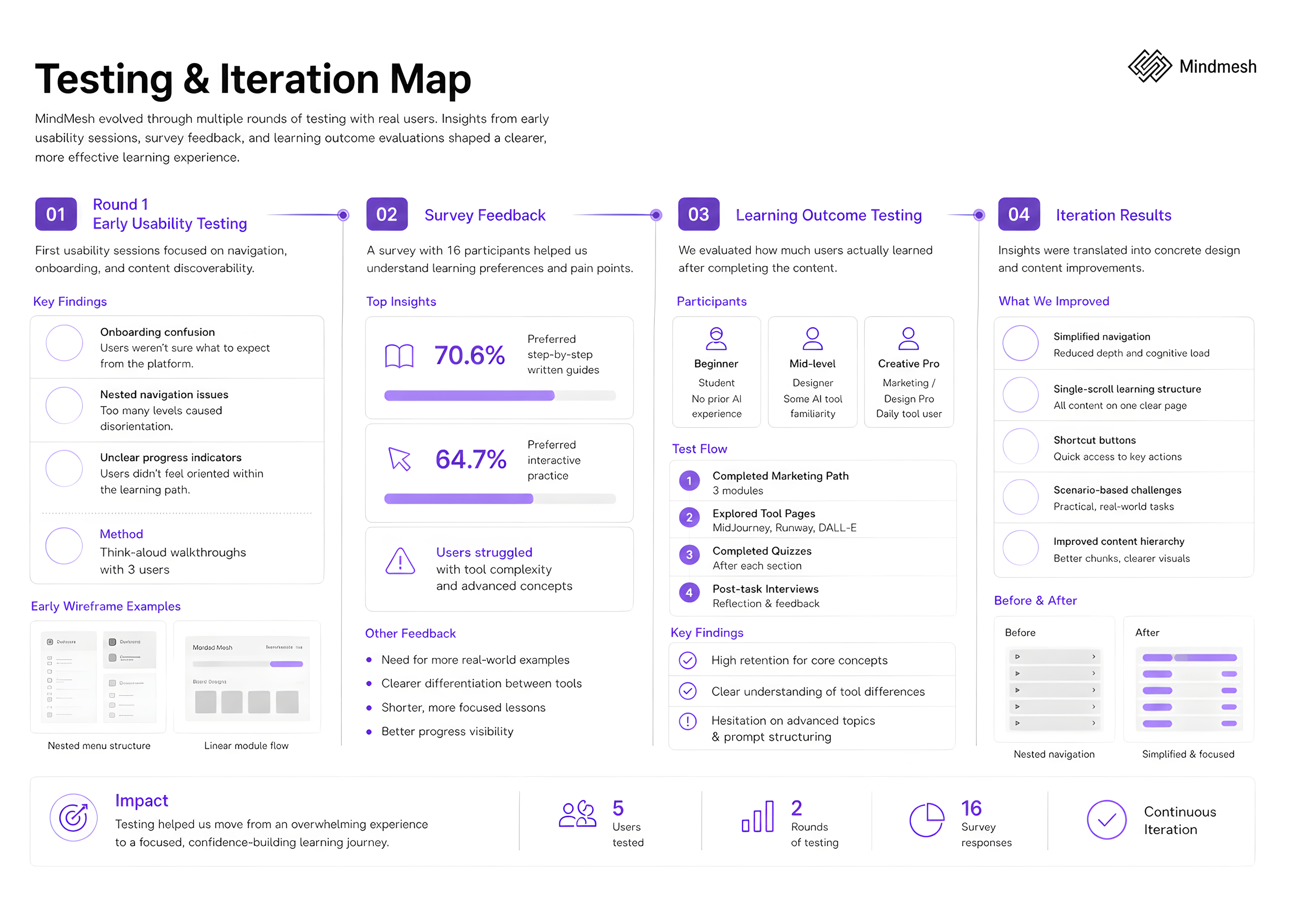
The project combined early survey work with 34 respondents, a final survey with 16 mixed-background users, two rounds of in-person testing, and a learning-outcome evaluation. Early findings pointed toward low confidence, terminology confusion, and a strong preference for step-by-step visual guidance. The final survey showed that 11 of 16 participants had never used MidJourney, Runway, or DALL·E, and average self-reported confidence was 2.3 out of 5. MidJourney was identified as the most confusing tool due to unfamiliar prompt syntax. These signals shaped the platform's learning structure from the outset.
Learning preference gap
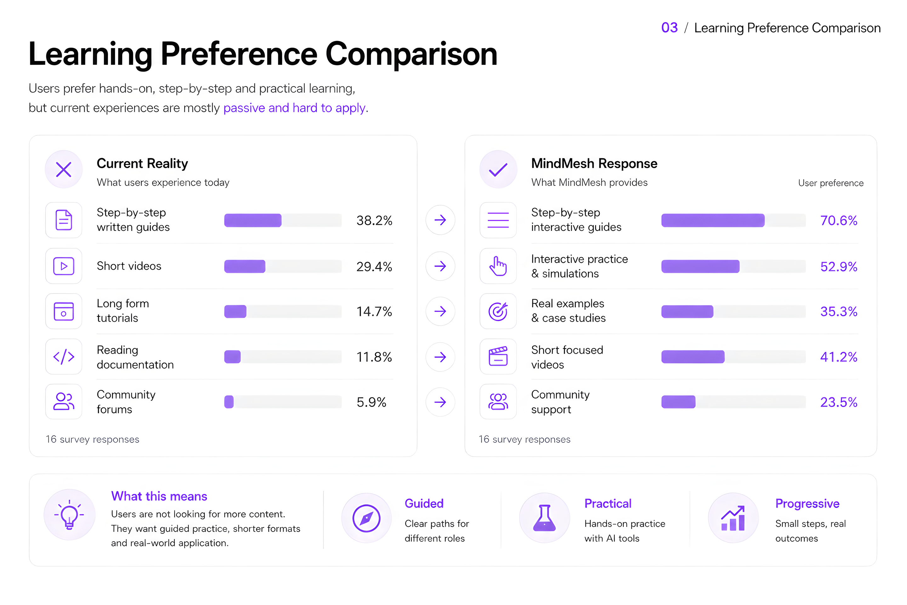
A key finding was the mismatch between what users currently experienced and what they actually needed. Most existing resources offered video-heavy general courses or scattered tutorials. Users consistently preferred step-by-step written guides, interactive practice, and real examples tied to creative workflows, in formats that existing platforms rarely combined in a role-specific way. MindMesh positioned itself to close that gap by organizing learning around roles, applied tasks, and practical tool scenarios rather than abstract AI theory.
Learning architecture
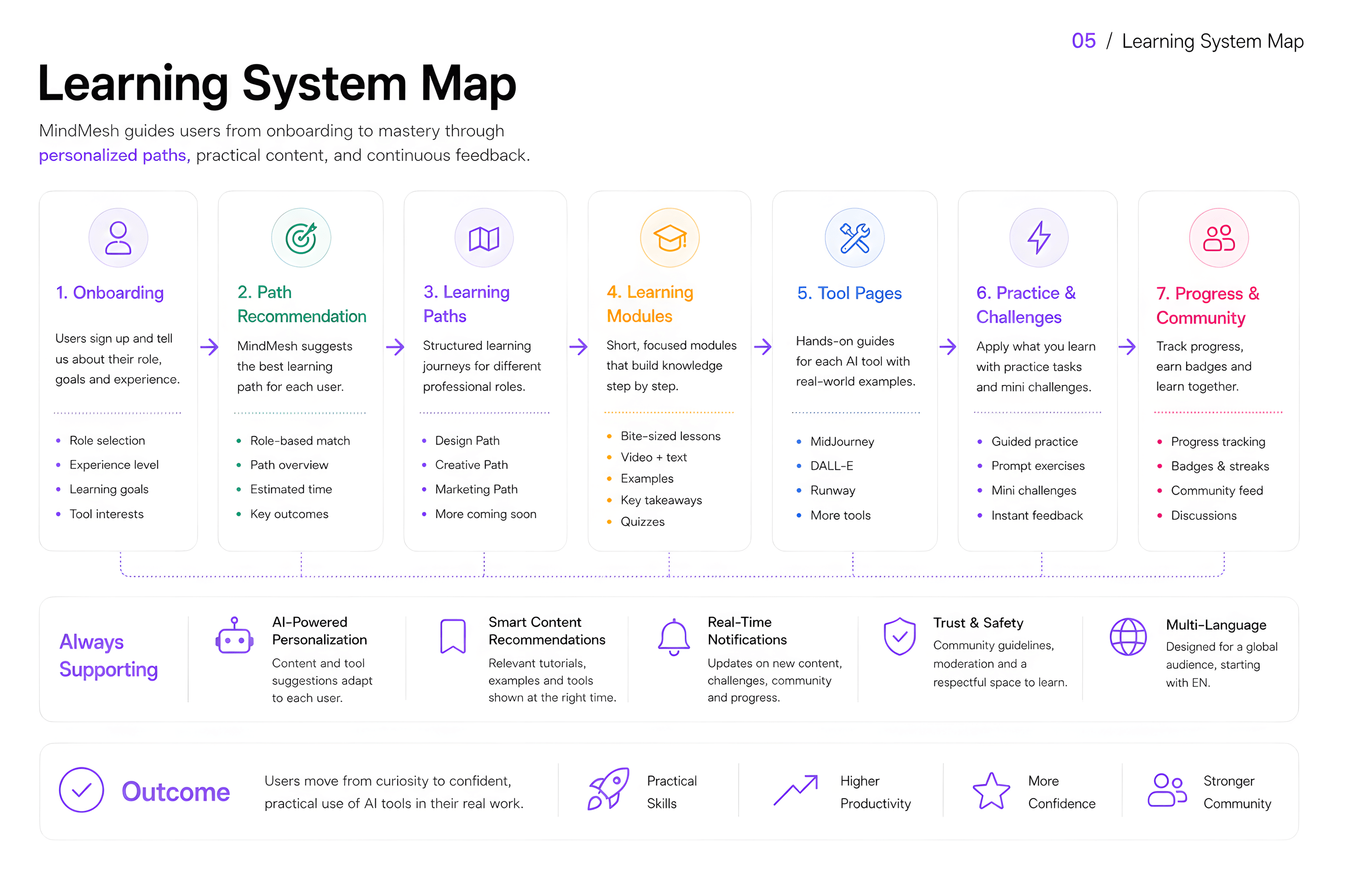
MindMesh is designed as a learning system, not a content library. The core structure connects onboarding, path recommendation, modules, tool pages, practice tasks, progress feedback, and community in a single guided loop. Users enter through their role and goal rather than searching blindly across tools. Each path builds understanding progressively: from broad tool awareness through short modules to hands-on practice and self-assessment. The architecture keeps the relationship between learning paths and tool pages explicit, treating tool pages as extensions of the module journey rather than separate content islands.
Platform structure
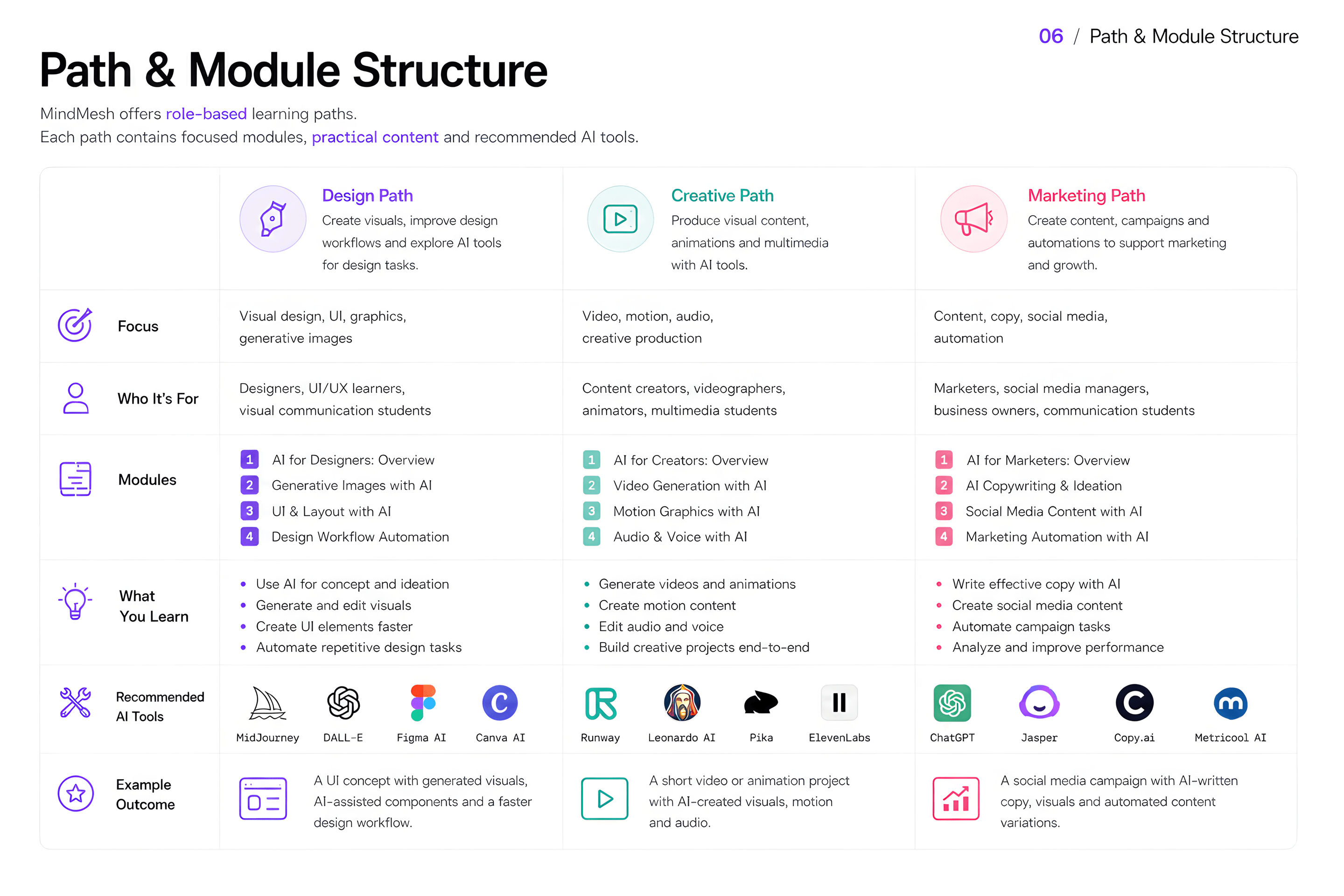
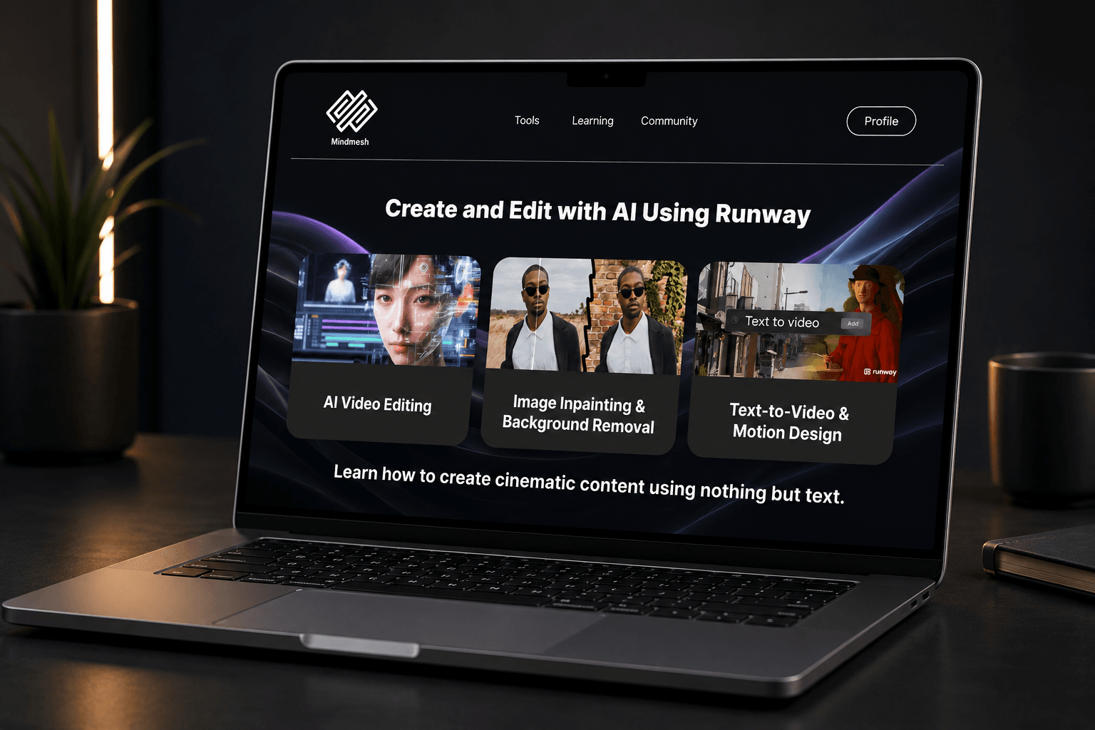
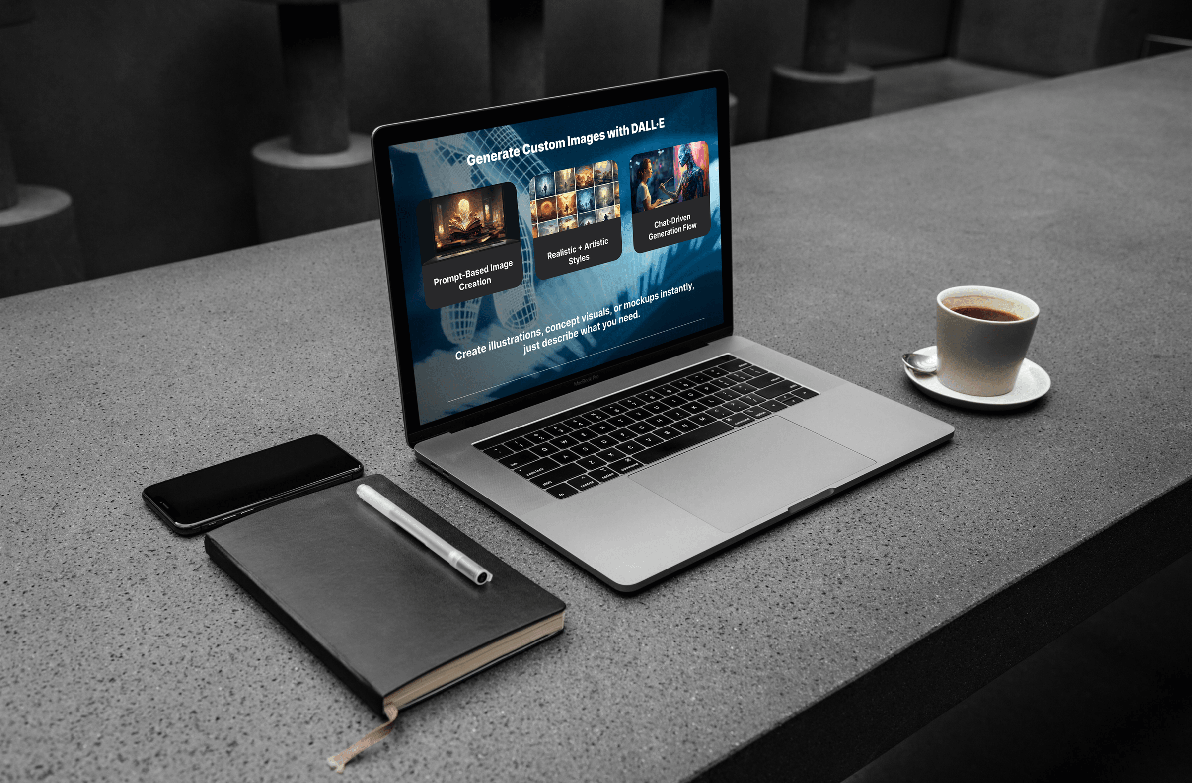
MindMesh offers three role-based learning paths: Design, Creative, and Marketing. Each path contains sequential modules focused on practical AI tool use within that role's workflow. Tool pages support hands-on practice beyond the module flow, providing tool-specific guides, prompt formulas, quick tips, use-case cards, and interactive quizzes. The Design path focuses on visual and motion workflows using tools like Runway, DALL·E, and Kling AI. The Creative path covers prompt writing and visual ideation through MidJourney and Firefly. The Marketing path addresses campaign content, social reels, and automation through Kling AI, Jasper, and similar tools.
User scenario
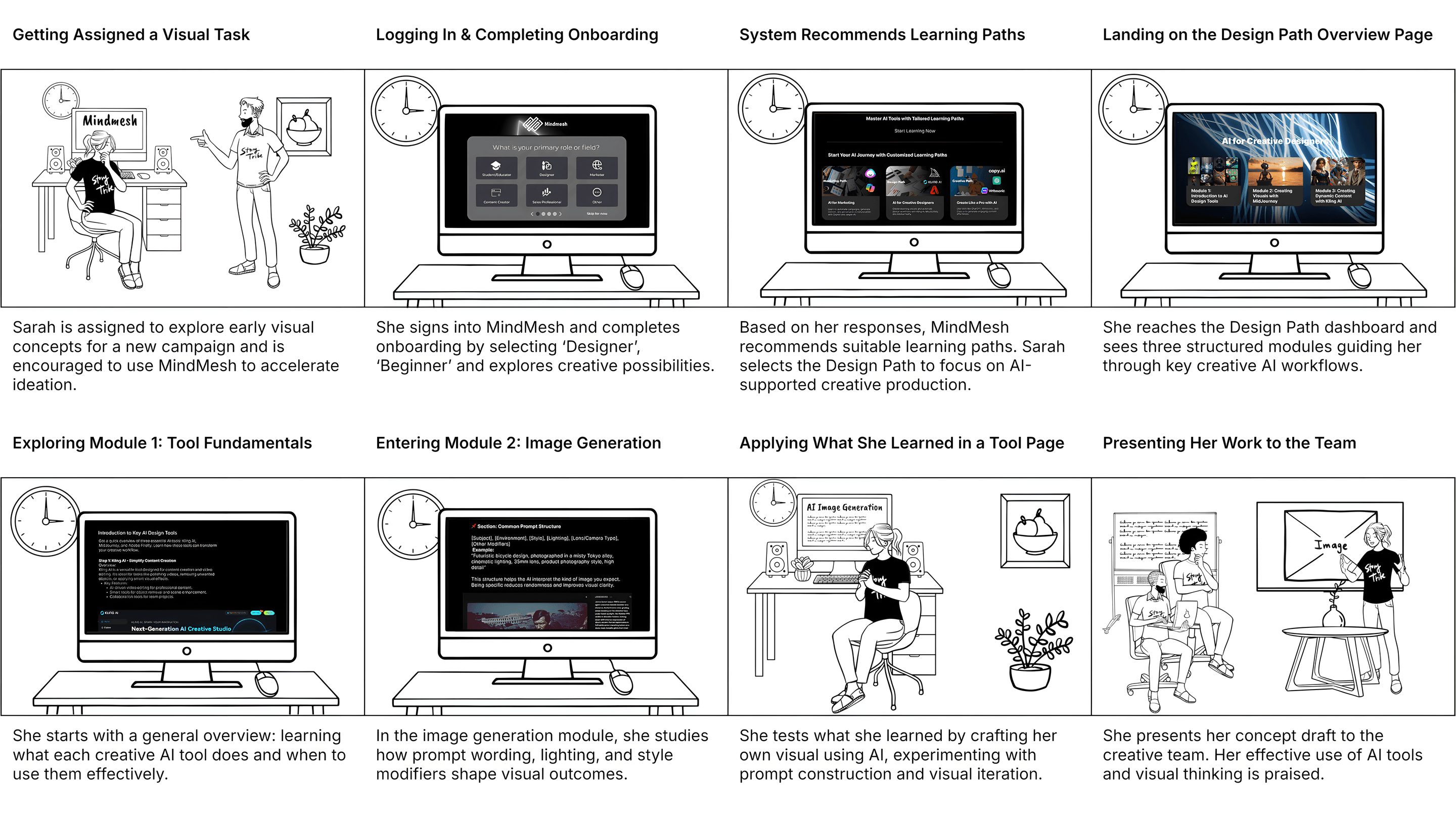
To make the platform structure concrete, the design traces a real journey: Sarah, a junior designer assigned to explore AI for a campaign, logs in, completes onboarding, selects the Design Path, works through Module 1 (Tool Fundamentals) and Module 2 (Image Generation), applies what she learned in a tool page, and presents her output to the team. This scenario shaped onboarding depth, module sequencing, tool page layout, and the pacing of the overall learning flow.
User groups
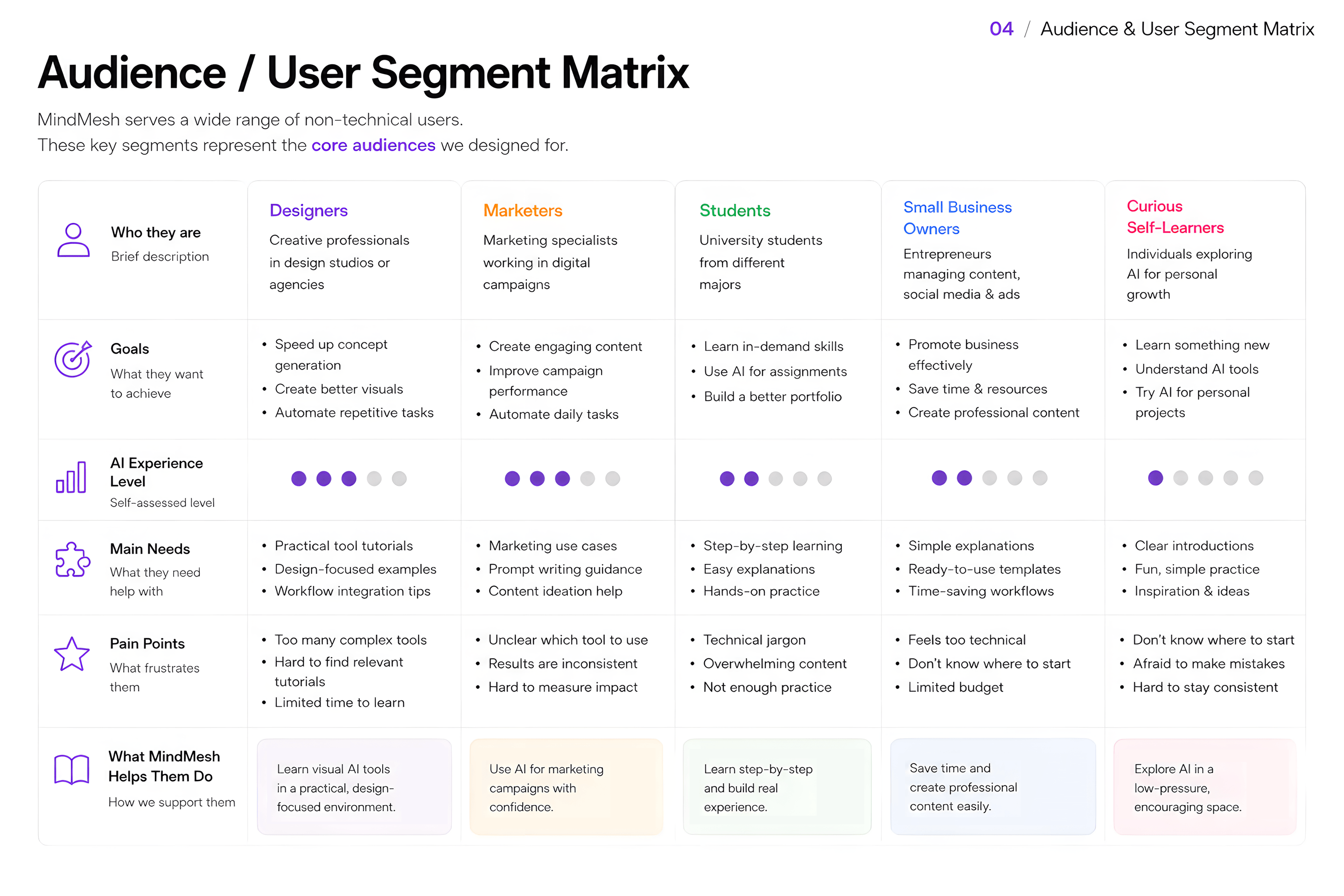
The original project explored ten detailed personas. The portfolio version compresses these into five learner profiles that capture the real range of needs: the beginner who needs low-jargon, visual walkthroughs; the creative designer who needs prompt logic and tool comparisons; the marketing professional who needs applied campaign scenarios; the intermediate user who wants depth, shortcuts, and challenge cases; and the solo creator who needs simple, affordable AI workflows without complexity overload. The platform's onboarding questionnaire and level-tagging system respond to each of these needs within one product structure.
Testing and iteration
Testing moved in two distinct phases. The first round focused on usability: three design students completed early onboarding and module flows in person, revealing that navigation depth caused disorientation and that progress cues were not visible enough. This led to a simpler single-scroll layout and clearer progress indicators. A 16-participant online survey then identified terminology confusion as a second barrier, resulting in a glossary and simplified language across module content. The second round shifted focus to learning outcomes: whether users could understand tool differences, remember concepts, and apply them to practical scenarios, rather than simply navigating the interface.
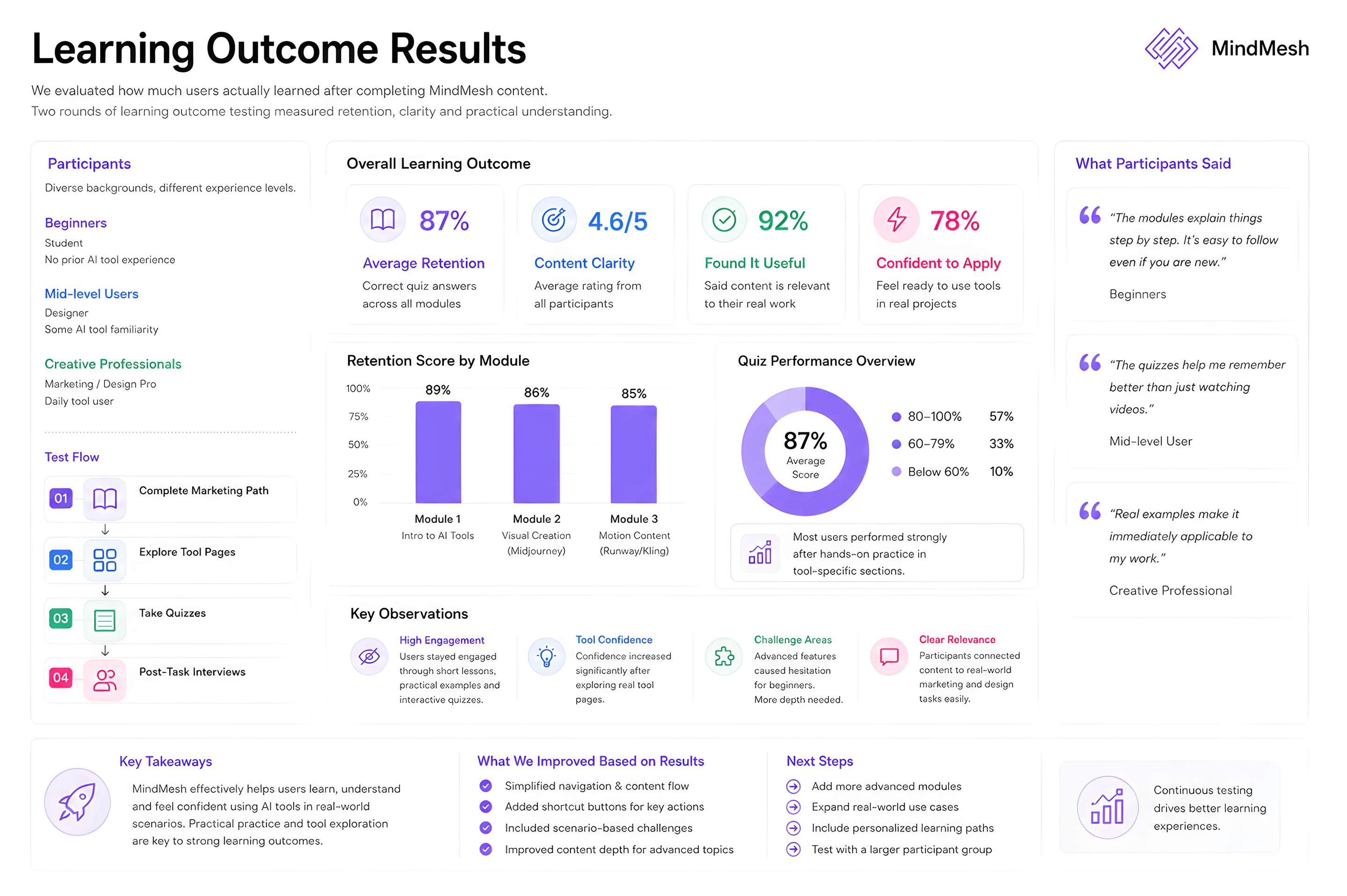
Learning outcome results
The second testing round evaluated three participants with different experience levels. A beginner participant scored 4 of 6 on the learning check and showed improvement across the path, particularly in the Kling AI module. A mid-level user completed all six checks confidently but wanted deeper challenge-based content. An early-career creative scored 5 of 6 and directly connected the Kling AI module to a realistic social media workflow. Module clarity ratings averaged between 4 and 5 out of 5 across all three modules and tool pages. The strongest result was Module 3, which received a perfect score on clarity, reflecting a well-structured use case, visual output examples, and clear workflow relevance.
Reflection
MindMesh is strongest as a learning-experience prototype: it connects onboarding logic, content architecture, modular tool practice, and outcome testing into one coherent product concept. The project's clearest success is showing that a structured learning path, rather than a tool directory, can help non-technical users build understanding and confidence with AI tools in a short session. The known limitations are honest ones: the prototype does not include a real content-management backend, advanced user depth needs further development, and a platform built around specific AI tools would need a continuous update model as tools evolve. If continued, the next step would be deeper challenge-based content for intermediate users, long-term retention testing, accessibility refinement, and defining how tool pages would stay current as the AI landscape changes.
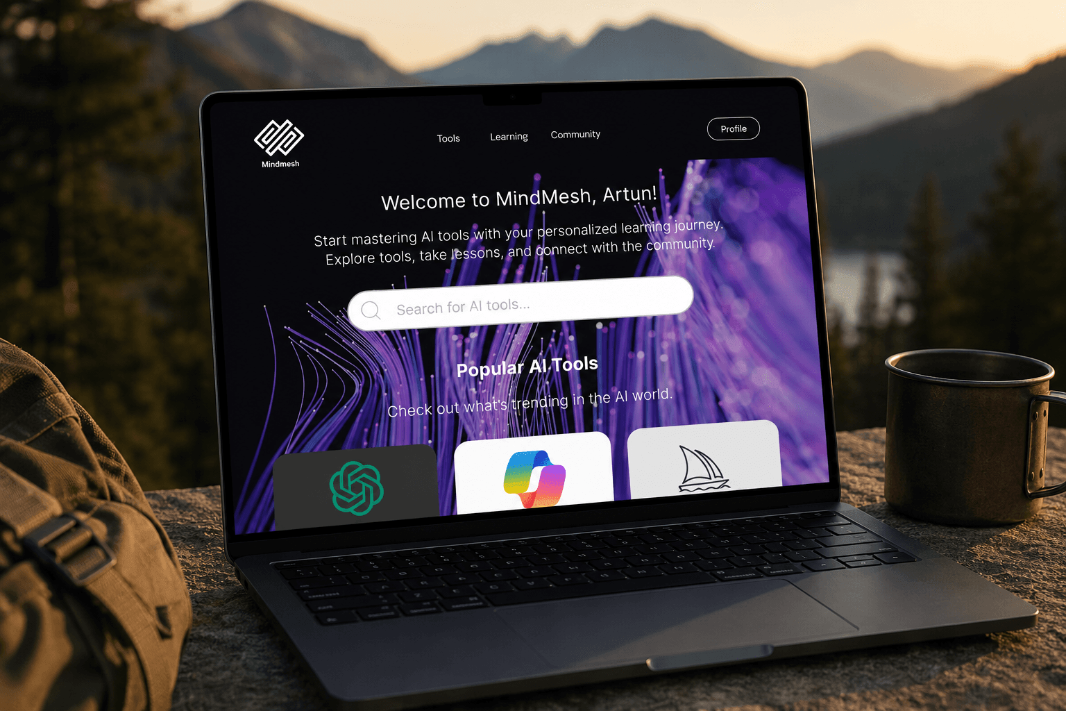
The interface uses a dark, high-contrast visual language with purple and blue accents, rounded card surfaces, and modular content blocks. The design goal was to make AI tool learning feel contemporary and structured without relying on generic neon aesthetics. Repeated card patterns support tool discovery, learning modules, progress feedback, and community browsing through a consistent visual system. The platform is designed as a web experience, with a persistent top navigation linking Tools, Learning, and Community.
Onboarding and personalization
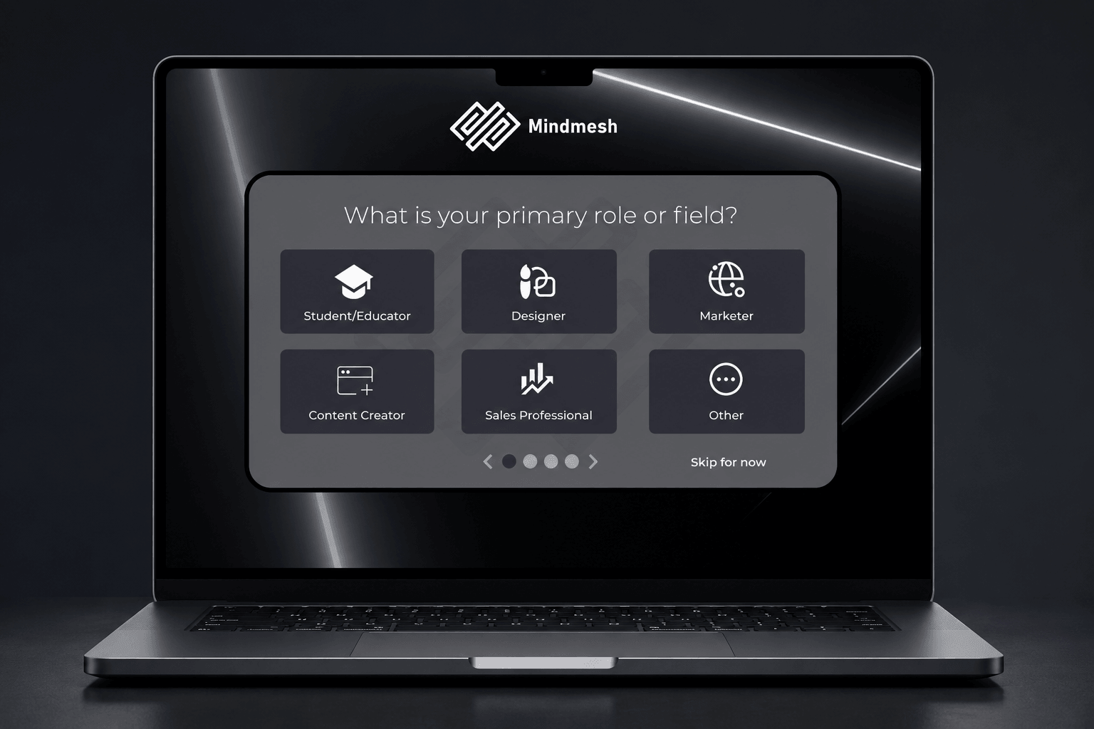
The onboarding questionnaire asks four questions: role or field, AI familiarity level, learning goal, and preferred learning style. These inputs map directly to a recommended starting path while keeping users free to explore other areas. The questionnaire was designed to feel short and purposeful: each question explains why it is being asked, and users can skip or adjust preferences after onboarding. The role selection screen uses icon-labeled cards rather than a dropdown to reduce cognitive load during first entry.
Learning paths
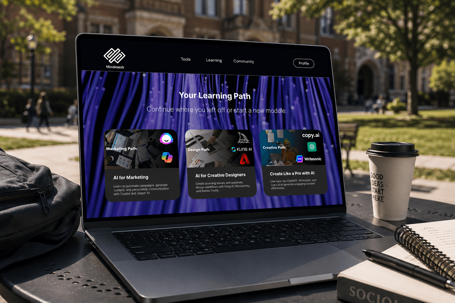
The learning section organizes the experience around three paths: Marketing, Design, and Creative. Each path shows a banner image, a short description, and the modules contained within it. Users can continue from where they left off or start a new module. Path cards use full-bleed imagery and large type to make each learning direction feel distinct and easy to choose between. The 'Start Learning' call-to-action is persistent and accessible from the dashboard without requiring navigation.
Tool pages
Each AI tool has a dedicated content page that follows a consistent anatomy: tool purpose, use-case cards, tutorial preview, tool highlights, prompt examples, quick tips, and an interactive quiz. This structure makes every tool page both educational and actionable. Tool pages connect back to the relevant learning path, so users always have a clear next step. The repeated layout reduces cognitive load across different tools and makes the platform feel scalable: new tools can be added without redesigning the content system.
Tools discovery
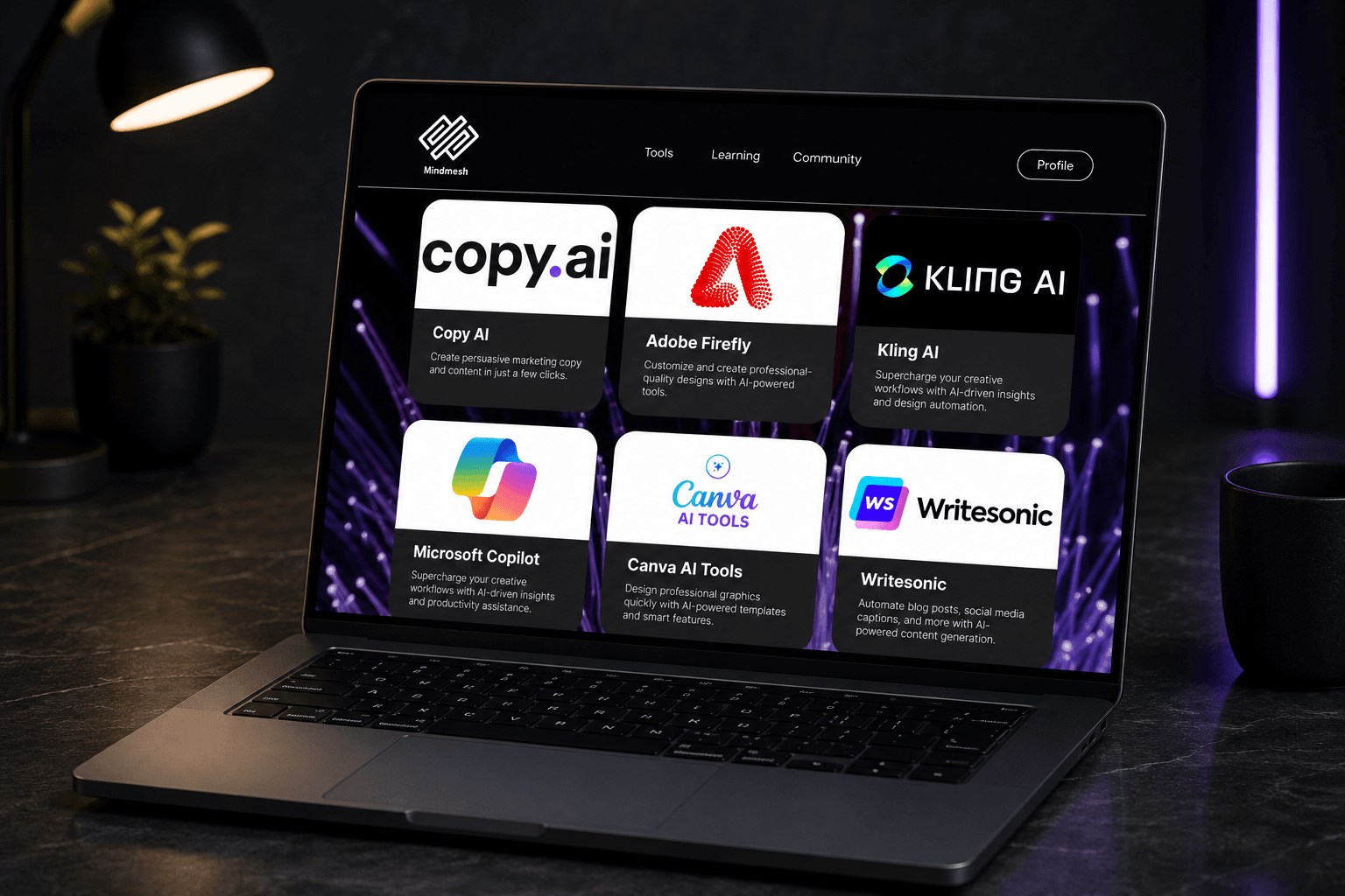
The tools landing page presents the full AI tool catalog in a grid of branded cards. Each card shows the tool name, logo, and a short description of its primary use. The grid supports browsing and comparison without requiring users to already know which tool they want. Users can access tool pages directly from this grid or reach them through their assigned learning path. The combination of direct access and path-guided discovery ensures that both structured learners and exploratory users can find what they need.
Content type system
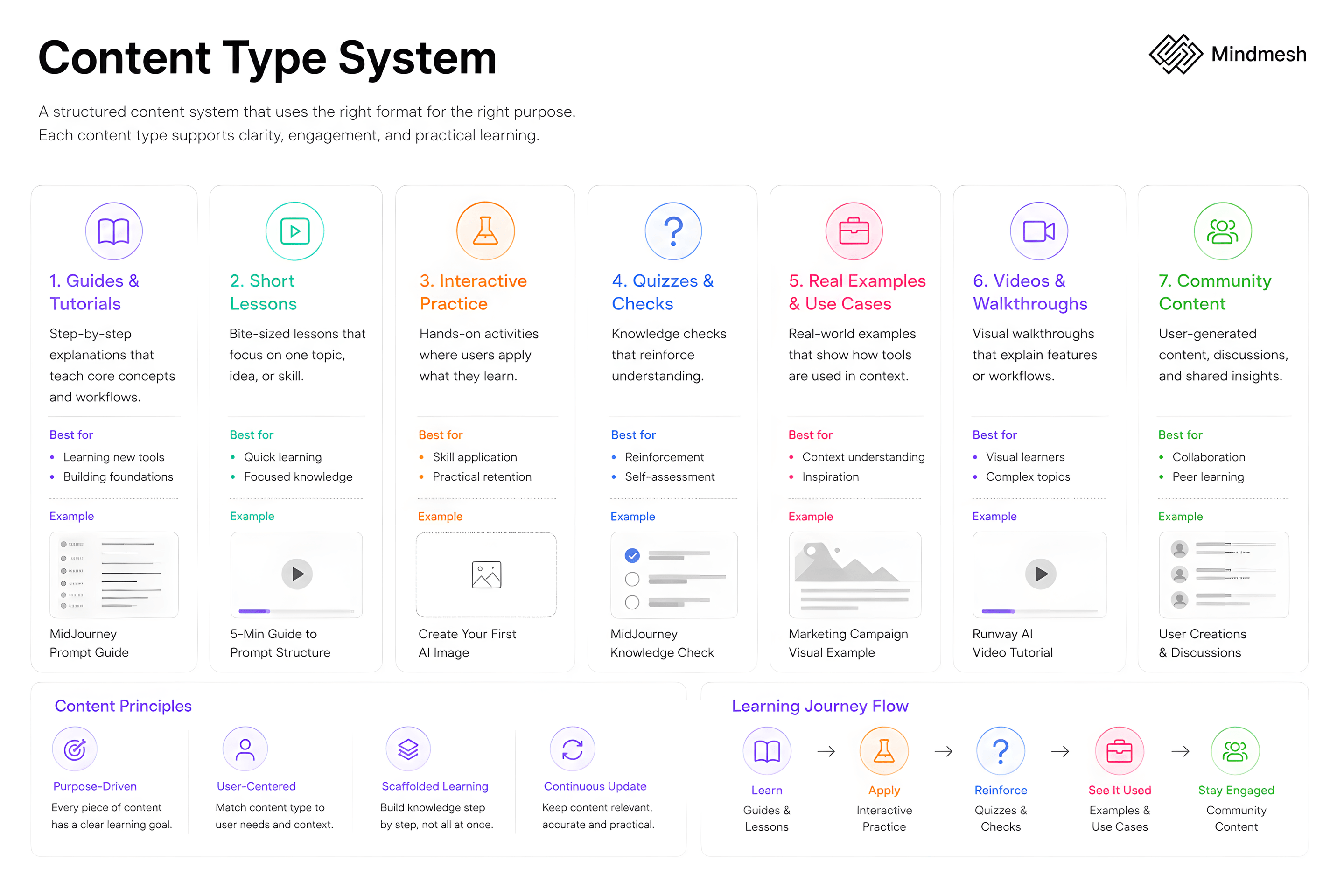
MindMesh uses seven distinct content formats across its modules and tool pages: step-by-step guides, short lessons, interactive practice tasks, quizzes and knowledge checks, real examples and use cases, video walkthroughs, and community content. This variety ensures that different learner types: those who prefer reading, doing, watching, or discussing, can engage with the platform in a format that works for them. The content type system also supports the platform's progression logic: early modules lean on guides and examples, while later modules introduce quizzes and challenges.
Quiz and practice
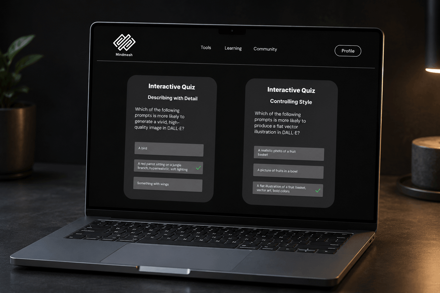
Each module and tool page ends with an interactive quiz that checks whether users understood the content rather than only navigated it. Quizzes use multiple-choice questions grounded in the specific tool or concept covered. The learning-outcome testing phase confirmed that these checks were effective for beginner and early-career users, who reported that the quiz format helped them consolidate what they had read. The quiz interface uses a clean two-column card layout, keeping the question and answer options scannable without scrolling.